
Package Room Visual Management Standards: a “visual grammar” that cuts search time
Every package room pays a hidden “search-time tax.” A delivery gets scanned in, but then it’s placed wherever there’s space. A different person comes on shift, can’t decode the logic, and starts moving items again. The next handoff turns into “I think it’s on the left wall somewhere.” With turnover, part-time coverage, and busy desks, that tax compounds into slower pickups, more mis-sorts, and a room that only one or two people truly understand.
Package room visual management standards fix that without a redesign project. Think of it as a simple visual grammar: a small set of rules for zones (where things live), shelf names (how locations are spoken), color cues (how to sort fast), and exception markers (what to do when something doesn’t fit). When those four pieces are consistent, a new staff member can learn the room in one shift—and the room stays readable even when volume spikes or coverage changes.
This article focuses on practical, operational standards you can install with tape, labels, and a short set of rules—plus a weekly photo checklist that keeps the system from drifting. The goal is resilience: anyone should be able to intake, place, find, stage, and hand off packages quickly, using the same shared language every time.
Define the Visual Grammar: Zones, Names, Colors, and Exception Markers (What Must Never Change)
Package room visual management standards work when they behave like a small, stable language. If the “words” keep changing (a zone renamed, a shelf label moved, a color repurposed), staff stop trusting the room and go back to searching, asking around, or creating personal systems. The goal is a visual grammar that any front-desk or package-room staff member can read at a glance—even on a busy shift with interruptions.
paragraphs continued: This grammar should be simple enough to teach in one shift, strong enough to survive turnover, and strict enough that handoffs are unambiguous. You are not redesigning the room—you are defining a permanent standard set (zones, names, colors, and exception markers) plus a controlled way to evolve it without breaking muscle memory.
- Treat the room like a map: every package must have one valid “address” at any moment (zone + shelf name), even if it’s temporary.
- Use visual cues to reduce decisions: staff should not have to “choose a good spot”; the standards should make the correct spot obvious.
- Make standards speakable: a concierge should be able to say, “It’s in Active Storage, B-3, middle shelf,” and any coworker should find it fast.
- Protect the standard set: changes are rare, deliberate, and documented—otherwise turnover resets learning every month.
The four primitives: zone, shelf name, color cue, exception marker
Think of these four primitives as the only building blocks you allow for package room organization standards. If you keep them consistent, you can change volume, staffing, or carriers without the room becoming unreadable.
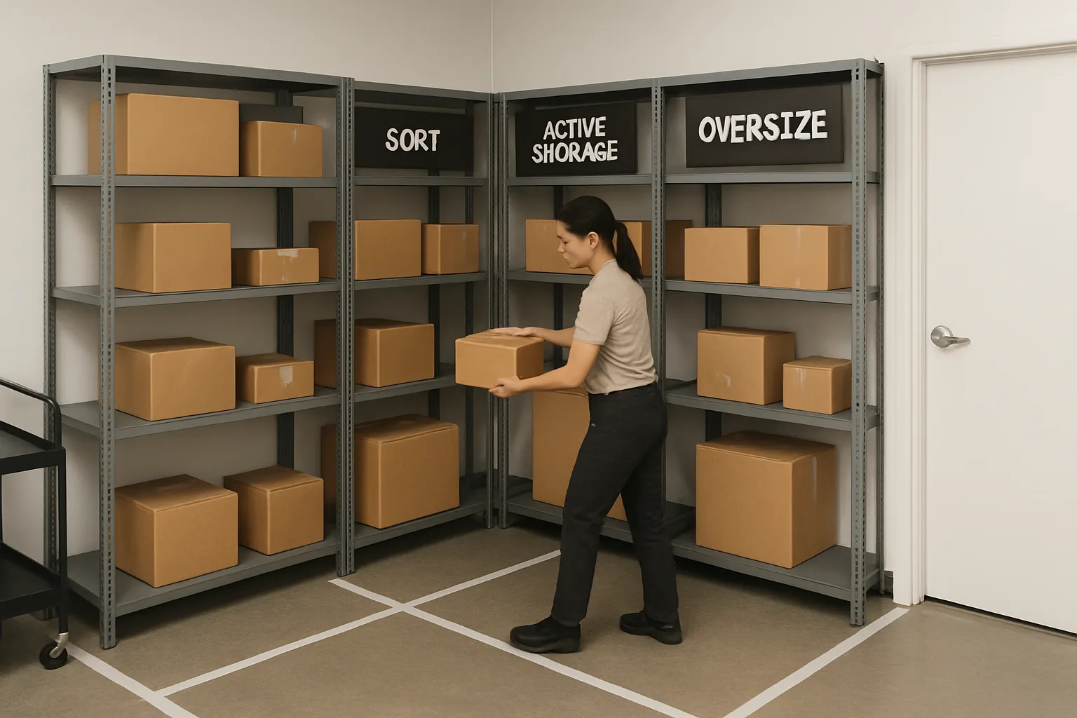
Zone is the largest unit of meaning. It tells staff what phase a package is in (intake, active storage, oversize, outbound/return, etc.). A zone answers: “What is this area for?”
Shelf name is the address. It tells staff exactly where something lives within a zone. A shelf name answers: “Where exactly do I put it or retrieve it?” A strong shelf labeling system makes the location obvious, unique, and easy to say out loud during a handoff or while scanning QR labels for accountability logs (without adding steps). 5S for mailrooms lives or dies on this ‘set in order’ clarity: every location has one name, and every name points to one location.
Decision rules: what gets a name vs a number; when to split a zone
Most confusion comes from over-labeling (too many categories) or under-labeling (everything becomes a pile). Use these decision rules to keep the package room visual management standards simple and durable.
What gets a name vs a number: use names for concepts, numbers for addresses. A zone should usually be a name (Active Storage, Oversize, Exception Hold). A shelf should usually be an address (A-1, A-2, B-1) or a structured location code (North-2-Mid). Avoid naming shelves with meanings that can drift (“Large Packages,” “Amazon,” “Today”). Meanings change; addresses don’t.
When to split a zone: only split a zone when the cost of mistakes is high or the volume consistently forces re-sorting. Examples that justify a split: (1) oversize that blocks walkways or shelves, (2) a high-frequency pickup staging area that must stay clear, (3) a controlled hold area for issues that need follow-up. Examples that usually do not justify a split: individual carriers, daily micro-zones (“Monday pickups”), or ad-hoc categories that only one person understands.
Stability rules: change control for labels/colors so turnover doesn’t reset learning
The fastest way to lose the benefit of visual standards is informal change. One person moves labels to “make it better,” and now half the team is searching because their mental map is wrong. Build simple change control into daily operations.
Assign one owner for the standard set (often the property manager or lead concierge) and one backup. Their role is not to micromanage the room; it’s to prevent untracked drift.
Set a rule: labels, zone names, and color meanings do not change during a shift. If a change is truly needed, it is scheduled (end of day or low-volume window), implemented consistently, and captured for training and handoffs. If you use QR-label workflows, the same rule applies: don’t rename shelf addresses without updating the corresponding location references in your accountability process, or you will create silent mismatches that look like “lost” packages.
Exception markers: what they mean, who can use them, and how they get cleared
Exceptions are inevitable—damaged labels, unclear units, resident disputes, vendor pickups, items too large for shelving. What breaks rooms is when exceptions become permanent and start absorbing normal volume. The fix is to standardize exceptions as a visible, temporary state with a clear exit path.
An exception marker is a deliberate, limited signal that says, “This item is not in its final address yet, and here is why.” It should be obvious from across the room and should always trigger a next action (research, contact resident, return to carrier, move to oversize, etc.).
Define who can apply exception markers (for example: any front-desk staff can apply them, but only a supervisor clears certain categories like disputed pickups). Define a clearing cadence (daily review at shift change, plus a weekly purge). If exceptions are not cleared, you are training staff to ignore the system—exactly what package room visual management standards are meant to prevent.
Tape Lines That Do Work: Floor Boundaries for Flow, Not Decoration
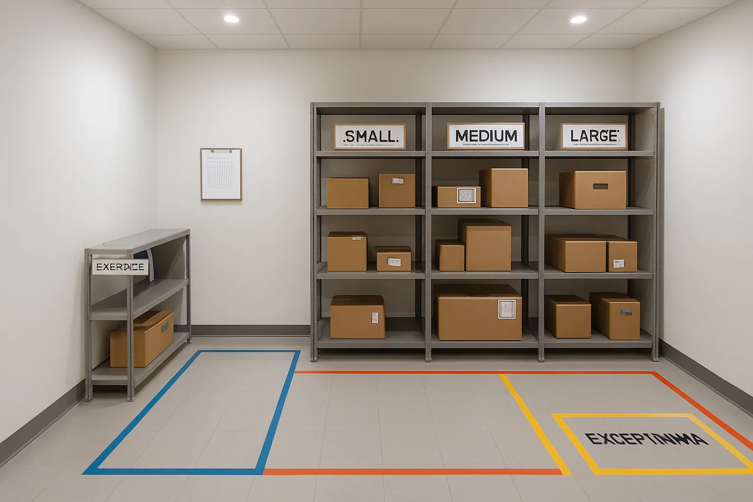
Tape is one of the fastest ways to make package room visual management standards real because it turns “where should this go?” into a glance decision. The goal is not to create a pretty map. The goal is to encode flow: where packages enter, where they get sorted, where they can live while awaiting pickup, and where exceptions go so they do not contaminate the main storage logic.
In buildings with turnover or part-time coverage, tape lines reduce two chronic problems: (1) searching caused by drifting habits (“we usually put USPS on that cart… unless it’s full”), and (2) misplacement caused by unclear boundaries (“this corner is kind of oversize, kind of returns”). A good tape plan is intentionally minimal, clearly labeled, and paired with simple rules that anyone can follow in one shift.
- Design principle: tape lines define allowed homes, not suggested parking. If an item is outside a boundary, it is either in motion (being worked) or it is wrong.
- Design principle: every boundary has a name. Unnamed tape is decoration.
- Design principle: fewer zones with strong rules beat many micro-zones that no one remembers under pressure.
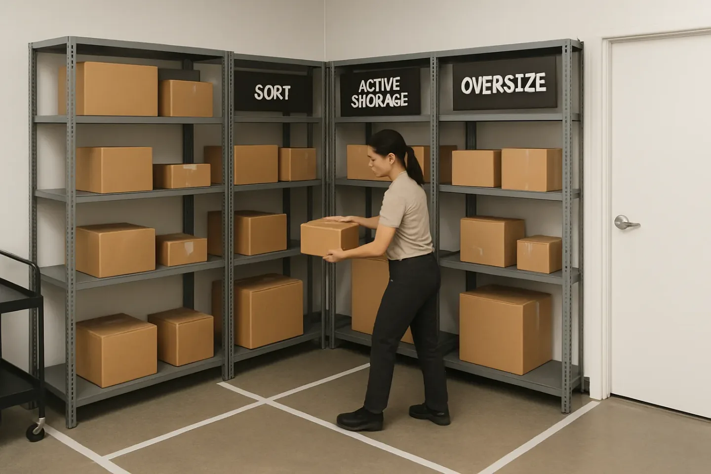
Minimum viable tape map: Intake, Sort, Active Storage, Oversize, Outbound/Return
Start with the smallest set of floor zones that creates reliable flow. You can expand later, but only after the basics are stable. A minimum viable tape map typically includes five zones:
Intake: Where new deliveries land before they are checked in or labeled. Keep it close to the door used by carriers, and keep it small enough that it cannot become long-term storage. Rule: nothing stays in Intake past the end of the current shift (or past a defined cutoff time).
Sort: A clear working surface area for scanning/QR labeling, unit matching, and quick grouping. Rule: Sort is for hands-on work; if no one is actively processing, the area should be mostly empty and ready for the next rush (this prevents “piles” from becoming a second storage system).
Directional cues: arrows, ‘no-drop’ lanes, and safe walking paths
Once zones exist, add direction so movement is consistent across staff. The point is to prevent the room from turning into a maze where people cut through storage, leave items in walkways, or stage packages in front of shelves so nothing is reachable.
Arrows: Use arrows to show the intended one-way flow when possible: Intake -> Sort -> Active Storage -> Pickup/Handoff. Even in a small room, arrows reduce “backtracking” that causes misplacements.
No-drop lanes: Mark one lane that must stay clear at all times. This is where staff and residents move, and where carts need to pass. Give it a clear label (e.g., NO DROP LANE) so a new staff member understands it is a rule, not a suggestion. If space is tight, a single continuous lane is easier to enforce than multiple narrow lanes that invite violations.
Handling oversize and irregulars without creating a junk zone
Oversize is where otherwise good systems go to die because irregular items do not fit shelves and tempt staff to “just put it in the corner.” Your oversize zone should prevent that corner from becoming a lost-and-found.
Define oversize by behavior, not size alone. Examples of oversize/irregular: long tubes, heavy boxes that should not be stacked, fragile marked items, large multi-box deliveries for one unit, and anything that blocks access if placed on standard shelving.
Give oversize its own taped boundary and a simple internal rule such as: place long items parallel to the wall, heavy items against the back line, and keep a reach path clear so nothing is buried. If you use carts, tape “cart parking” rectangles so carts stop drifting into walkways or blocking shelves.
Tape standards: widths, colors, label placement, and maintenance cadence
Consistency makes tape lines learnable. If each shift uses a different roll or style, boundaries blur and staff stop trusting them.
Width: Use one standard width for zone boundaries (commonly 2 inches) and a wider width for critical lanes (commonly 3–4 inches) so the “rules” visually pop. Pick what fits your floor and traffic; the key is to keep it consistent across the room.
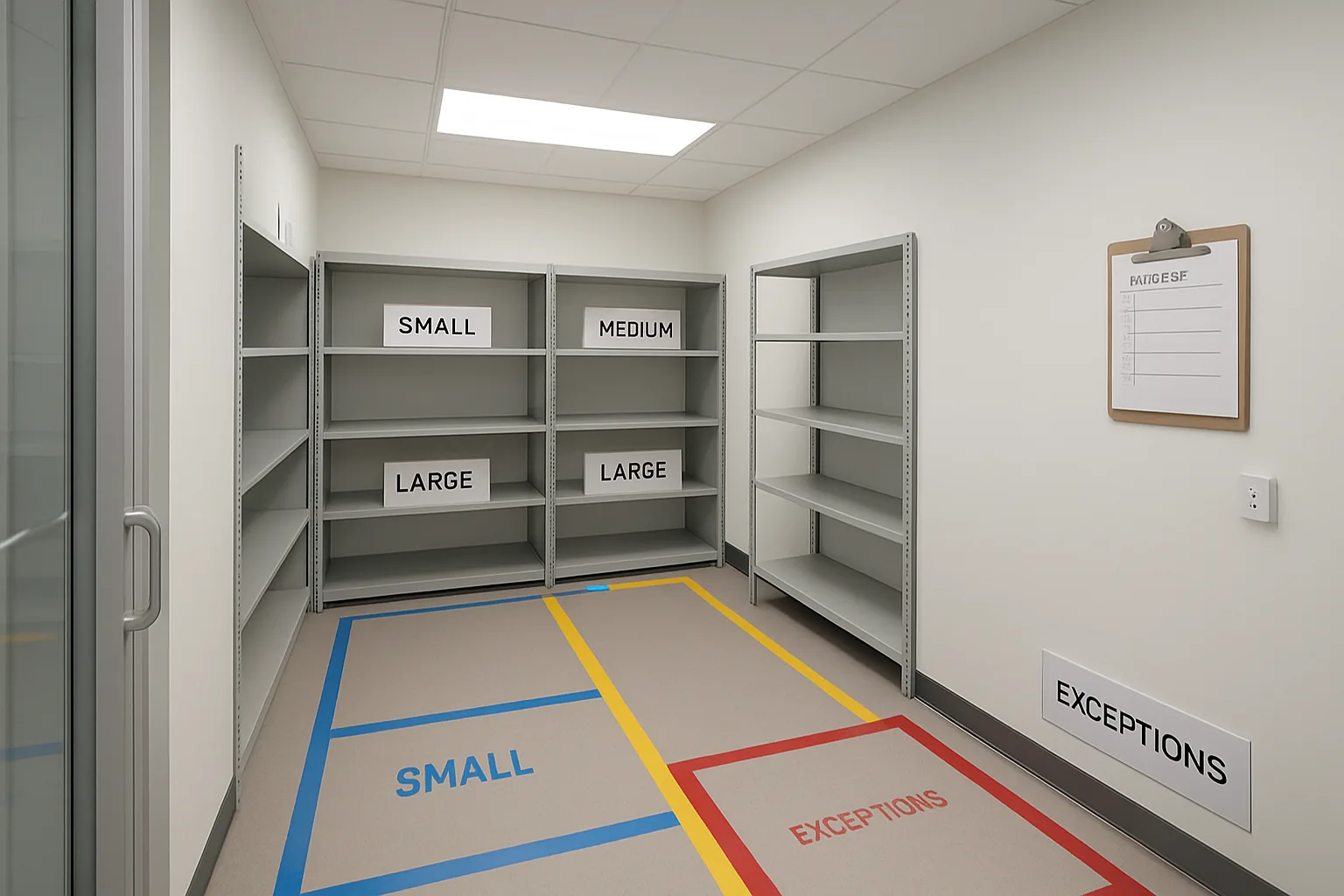
Colors: Keep colors function-based and limited. For example: one color for boundaries, one for no-drop/safety lanes, and one for exceptions/hold zones. If your building already uses colors in other areas (maintenance, fire egress), align rather than conflict. Whatever you choose, document it once and do not improvise in the moment (that is how color creep starts).
Common mistakes: too many micro-zones, tape drift, and unlabeled boundaries
Tape fails when it becomes hard to understand, hard to maintain, or disconnected from real behavior. These are the patterns that usually break tape-based controls and how to avoid them.
Too many micro-zones: If staff need to read a map to know where something belongs, you created complexity, not clarity. Consolidate to a few zones with strong rules and let shelf naming handle the detailed addressing (for example, shelves handle the difference between “A-1” and “A-6,” not tape).
Tape drift: Over time, tape peels, gets scuffed, or shifts during cleaning. When boundaries look sloppy, staff stop respecting them. Solve with a simple cadence: quick weekly inspection, replace peeling corners immediately, and full refresh on a predictable schedule. If a boundary moves even a few inches without explanation, it breaks muscle memory—so remeasure and reapply rather than “eyeballing” fixes.
Shelf Naming and Labeling: A Shelf Labeling System New Staff Can Learn in 10 Minutes
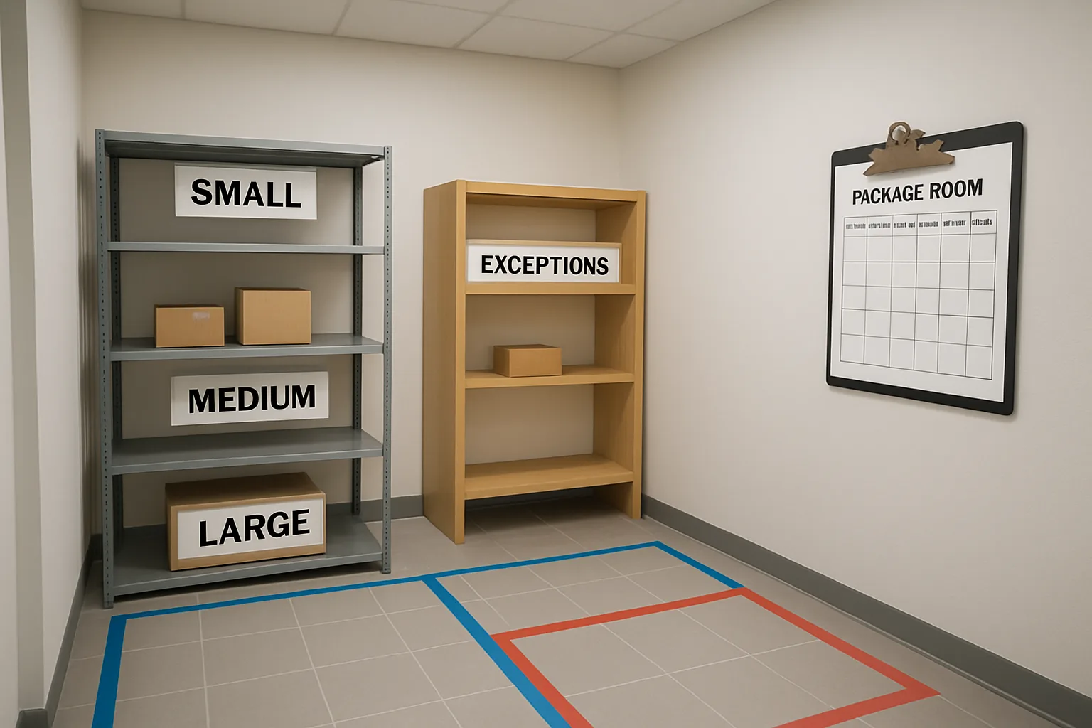
The fastest way to reduce the “where did it go?” time sink is to make every storage location speakable, unique, and obvious even when shelves are full. In strong package room visual management standards, a shelf is not “over there by the door.” It has an address that any staff member can say, write, and confirm during a handoff—without needing building-specific tribal knowledge.
The goal is not a clever naming scheme. It is a stable shelf labeling system that supports quick training, clean handoffs, and consistent placement when staffing changes shift to shift.
- Make every package location addressable (one shelf address per package)
- Make addresses readable from standing distance, even when bins are full
- Use one convention across the whole room (and across buildings if you manage multiple)
- Avoid “temporary” labels that become permanent exceptions
Naming convention options: ‘Zone-Shelf-Row’ vs ‘Wall-Bay-Level’ (pick one and stick)
Both conventions can work. The mistake is mixing them or changing conventions after staff learn muscle memory. Pick one format, document it in one page, and treat it as part of your package room organization standards.
Option A: Zone-Shelf-Row (Z-S-R). Use this when your room already has clear zones (Intake, Active Storage, Oversize, Hold). It’s intuitive because staff think in process steps.
Option B: Wall-Bay-Level (W-B-L). Use this when your room is basically “four walls of shelves” and zones are less important than physical landmarks. It’s intuitive because new staff can orient instantly: left wall, back wall, etc.
How to choose (simple decision rules)
Use these rules to avoid overthinking:
Choose Zone-Shelf-Row if you routinely move items through stages (intake to sort to storage) and you want shelf names to reinforce the workflow.
Choose Wall-Bay-Level if your room is tight, shelves are continuous, and staff will navigate by landmarks more than by process steps.
Recommended format examples (keep the syntax boring)
If you choose Zone-Shelf-Row, a practical format is: Zone letter + shelf number + row letter. Example: A-03-B.
A = Active Storage zone, 03 = third shelf unit in that zone, B = middle row.
If you choose Wall-Bay-Level, a practical format is: Wall code + bay number + level number. Example: L-04-2 or Back-04-2 (but pick one style and use it everywhere).
Readable labels: font size, contrast, and where labels go so they’re visible when full
Labels fail for predictable reasons: they are too small, blocked by packages, or inconsistent across shelf types. Design labels to be readable during a busy desk shift, not during a quiet setup day.
A useful standard is: readable at arm’s length while holding a package. If staff have to lean in or move boxes to confirm the address, the label is not doing its job.
Label design rules (practical, no special equipment required)
Keep label design consistent across the entire room: same font style, same structure, same placement. Reserve color for function cues, not for making label text “look nice.”
Placement rules that prevent “label hiding”
Use two placements on each shelf unit when possible:
Primary label: on the outer front edge of each shelf or bin lip, where it stays visible when the shelf is full.
Secondary label: on the vertical upright (side post) at eye level, so staff can confirm the shelf unit even if the front edge is blocked by oversized boxes or bags.
Contrast and durability rules
Choose high-contrast text (dark on light or light on dark). Avoid fancy fonts and low-contrast gray-on-white labels that disappear under fluorescent lighting.
Protect labels from peeling and smudging. If you laminate, do it consistently; if you don’t, use tape or label stock that survives routine wipe-downs. The standard is: labels should still be readable after normal cleaning and handling for weeks, not days.
Address examples: how staff should say it at the desk during a handoff
A shelf address only works if staff actually use it in conversation. Bake the phrasing into your handoff script so it becomes automatic. The best addresses are short enough to say once, and clear enough to confirm once.
Use “repeat-back” language when the desk is busy or you are handing off between shifts. This acts as a built-in error check without adding a new process step.
Speakable handoff scripts (examples)
Example using Zone-Shelf-Row:
“Your package is in Active Storage, shelf A-03-B.”
Repeat-back: “A-03-B, middle row.” (staff member confirms before walking away)
Example using Wall-Bay-Level
“Your package is on the Left wall, bay 4, level 2: L-04-2.”
Repeat-back: “L-04-2.”
How to handle multi-item pickups without confusion
If a resident has multiple packages in different locations, don’t invent new language. Use a simple list:
“You have three items: A-03-B, A-03-C, and Oversize O-01.”
This prevents the common failure mode where staff “go looking for the rest” with no clear endpoint.
Edge cases: shared shelves, mixed carriers, and temporary overflow
Edge cases are where standards break down—especially with turnover or part-time coverage. The key is to define allowed exceptions ahead of time so staff do not create their own ad hoc system.
Shared shelves and mixed carriers (avoid hidden rules)
Shared shelves are fine if the address remains the primary rule. In other words, “carrier” should not override the shelf address unless you have a documented reason.
If you do need to separate for operational reasons (e.g., secure signatures, refrigerated items, or high-value holds), treat that as a zone or exception marker, not a silent staff preference.
Temporary overflow (the ‘it’s just for today’ trap)
Overflow should still have an address. Otherwise it becomes a perpetual scavenger hunt.
Create pre-labeled overflow addresses before you need them, such as OF-01 through OF-06 (or a specific wall/bay reserved for overflow). Then your overflow is still “placeable” and “findable” even during seasonal spikes or a delivery surge.
Ambiguous items: no label, no unit, wrong name
Define a single rule: ambiguous items do not go into Active Storage. They go to a clearly labeled exception shelf with its own address (for example, X-01 or Hold-H-01) until resolved.
This prevents staff from “tucking it somewhere” and forces the ambiguity to surface during the shift, not during pickup.
Linking shelf names to QR labels and accountability logs without adding extra steps
If your desk uses QR labels or any form of logging, the shelf address should be captured at the same moment the package is placed—without a second round of typing or a second label.
The simplest approach: make shelf address part of the standard placement routine: scan, place, confirm the shelf address once.
Low-friction ways to connect shelf addresses to tracking
Use the shelf address as a required field in your log or handoff note (even if it’s a quick text entry). Staff should be trained to never leave it blank.
If you use QR labels on packages, keep the process consistent: scan the package label, then immediately choose or enter the shelf address you are physically standing at. The shelf label is the “source of truth” that prevents fat-finger errors.
If you print internal stickers or write a short note, the only extra information worth adding is the shelf address (e.g., “A-03-B”). Do not add new codes that compete with the shelf labeling system.
One rule that keeps it simple across staffing changes
Do not allow “I put it somewhere easy to remember” as a valid action. The room’s job is to remember, not the staff member. When every package has a shelf address that is visible and used in handoffs, new staff can succeed in one shift—and your standards stay resilient even when coverage changes daily.
Color Cues and Category Rules: Fast Sorting Without Thinking (and Without Over-Coloring)
Color is a shortcut for the brain, but only when it stays limited, consistent, and tied to actions. In package room visual management standards, colors should answer one question fast: “What do I do with this item next?” If colors start representing carriers, residents, shelf rows, special events, and random overflow at the same time, new staff lose trust in the system and revert to searching.
A practical rule: use color to communicate function (status or handling rule), and use shelf names/addresses to communicate location. That combination keeps sorting fast without creating a rainbow that needs constant retraining.
- Keep a single “color legend” posted at the intake/sort point and on the inside of the package-room door
- Limit to 4–6 colors total; if you think you need more, you probably need clearer shelf naming, not more colors
- Assign colors to actions/status (Hold, Oversize, Problem, Returns, etc.), not to carriers or resident groups
- Always pair color with a word label (and optionally a simple icon/stripe) so the system works under poor lighting, for color-blind staff, and on printed lists
Pick 4–6 colors max: assign to functions, not carriers (e.g., ‘Hold’, ‘Oversize’)
A small palette is easier to learn in one shift and harder to “drift” over time. Choose colors that are visually distinct from each other in your room’s lighting (fluorescent vs warm LEDs changes what looks distinct).
Start by mapping your most common package-handling decisions to colors. These are function cues, not storage cues; the shelf address still tells staff where it lives.
A workable 5-color legend (example you can adapt)
Use whatever colors you have on tape/labels, but keep the meaning stable. One example legend:
Green: Ready for pickup (standard flow; no special handling)
Yellow: Hold/Do not release (resident request, billing issue, ID verification, legal hold) — requires note in the log/QR record explaining why it’s yellow and who set it (date + initials)
Continue the same legend (example)
Blue: Oversize/Heavy (goes to oversize area; may require two-person move)
Red: Exception/Problem (damaged, leaking, missing unit, unreadable label, wrong building) — must move to exception zone and be cleared within a defined time window
Purple (or black/white stripe): Outbound/Return to sender (resident left, refused, carrier pickup scheduled)
What colors should never mean (avoid conflicts with carrier branding)
Don’t make colors mean “UPS vs FedEx vs Amazon.” Carrier branding already uses strong colors, and packages arrive pre-colored. If you choose brown for UPS, blue for FedEx, and you later get a brown box from a different carrier, the cue becomes ambiguous. Worse, staff may subconsciously “sort by box color” instead of the resident/unit.
Also avoid making colors mean “A–F last name” or “1st floor vs 2nd floor.” That’s location logic. Location belongs in your shelf labeling system (spoken addresses like A-03-B), not in tape colors. Colors should survive layout changes; shelf addresses can change only with controlled change management.
Accessibility: pairing color with text, icons, or stripe patterns
Assume at least one staff member (or temporary coverage person) will have some level of color-vision deficiency, will be working quickly, or will be reading cues from an angle. Make every color cue redundant.
Practical pairing options that stay readable on tape, bin tags, and shelf-edge labels:
Text label first, color second: “HOLD” on a yellow tag; “EXCEPTION” on a red tag; “OVERSIZE” on a blue tag (big, all-caps)
Accessibility pairing options (keep it simple)
Simple icons: lock for HOLD; exclamation mark for EXCEPTION; arrows-out for OUTBOUND/RETURN; weight icon for OVERSIZE. If icons feel too fancy, skip them and rely on text + stripe.
Stripe patterns: diagonal stripe = exception-type items; solid color = normal status. A black/white diagonal stripe is especially visible and prints well.
Placement rule: put the cue where hands go. Example: a HOLD tag should be attached near the shipping label so staff see it before lifting or scanning, not buried under plastic wrap or on the far side of a box.
Category rules: when to split by last name, unit range, or pickup day
Color tells “what,” but category rules tell “how to group” to reduce search time. Use category rules sparingly and only when volume makes a single shelf run inefficient. The wrong split creates two failure modes: items land in the wrong group, or staff must search multiple groups anyway.
Pick one primary grouping method for Active Storage, and only add a second layer when it clearly cuts search time without increasing mis-sorts.
Simple decision rules for grouping (choose based on your building)
Split by last name (A–F, G–L, M–R, S–Z) when: you have many pickups per hour and residents present at the desk by name more often than by unit. This works well for concierge-led handoffs where the resident says, “I’m Jordan Lee.”
Split by unit range (100–199, 200–299, etc.) when: residents commonly identify by unit, your log/QR workflow is unit-first, or you have multiple towers/lines where unit ranges map naturally to wings.
Split by pickup day only for holds/long dwell items, not for all packages. Example: a small “3+ Days” hold shelf reduces clutter in active shelves, but only if you have a reliable daily/weekly aging routine.
Rules to prevent category creep (the hidden cause of search-time tax)
Don’t mix grouping methods within the same zone. If one shelf bay is “A–F” and the next is “100–199,” new staff will hesitate and double-check every time.
Don’t create a category for a single person or a one-off scenario. Use an exception marker (like Red/EXCEPTION) instead.
Write the category rule on the shelf label itself, not only on a poster. Example: “ACTIVE | UNITS 300–399” is self-explanatory in the moment.
How to handle seasonal volume spikes without inventing new colors
Peak weeks (holidays, move-in, major online sales events) tempt teams to add quick fixes: new tape colors, new ad-hoc signs, random overflow corners. That’s how standards break and never return.
Instead, plan one “surge mode” that uses the same palette and the same meanings, with temporary capacity increases that don’t change the language.
Surge-mode tools that preserve the visual grammar
Add capacity with neutral cues: use plain numbered overflow racks that still follow your shelf address pattern (e.g., Overflow-01 to Overflow-10) rather than new colors.
Use the same function colors, just more of them: more Yellow HOLD tags, more Red EXCEPTION tags, more Blue OVERSIZE tags. No new meanings.
Create one temporary overflow zone with a clear start/end date sign (text, not a new color). Example: “TEMP OVERFLOW (remove by Monday 9am).” Then treat anything left after the date as an exception that must be cleared (Red).
Weekly Photo Checklist: Keep Standards Alive With a 10-Minute Visual Audit
Package room visual management standards only reduce search time if they stay true week after week. Turnover, part-time coverage, and busy handoffs cause slow drift: tape peels, shelf labels get covered, overflow becomes permanent, and exception piles grow. A weekly photo checklist solves this without a full audit or a manager walking every shelf.
paragraphs
The goal is simple: take the same set of photos from the same spots, compare them to a known-good baseline, and fix only what breaks the visual grammar (zones, names, colors, exception markers). This keeps package room organization standards stable while still allowing controlled exceptions when volume spikes or layouts change.
Set a repeating cadence (for example, every Monday morning or every Friday close). It should take one person 10 minutes. Store the photos in one shared place labeled by date, so anyone can see when standards started drifting and what was corrected.
- How to make it stick: assign one owner role (not a person) such as “AM front desk shift” or “closing concierge” so it survives schedule changes.
- Use the same device camera angle each week. Consistency is more important than high resolution.
- Keep a single baseline folder called “Standard photos” that new images get compared against.
- If you use QR labels for intake or shelf addresses, include at least one photo that shows QR placement clearly so staff can confirm they have not migrated or been covered.
The 8-photo set: entrances, each wall, oversize area, exception zone, staging lane
Pick eight fixed photo positions that capture the entire room’s “readability” at a glance. Mark the floor with a small dot of tape (or a discreet sticker) where the photographer stands for each shot. This avoids perspective changes that hide problems.
Recommended 8-photo set (adjust “Wall A/B/C” to your room):
1) Doorway view from outside: shows whether the room looks understandable before you enter (signage, no clutter at the threshold). 2) Intake zone: shows the receiving surface, scanner/label station if used, and whether incoming packages are staying in intake too long. 3) Wall A storage: captures shelf naming visibility and whether items are stored within boundaries. 4) Wall B storage. 5) Wall C storage or lockers. 6) Oversize area: shows whether irregular items are contained and labeled, not becoming a junk zone. 7) Exception zone: shows the exception markers (for example, “Unknown unit,” “Damaged,” “Hold,” “Return”) and whether anything is aging there. 8) Staging lane/pickup counter: shows whether staged items are inside tape lines and whether the lane is walkable and safe.
Pass/fail examples: what ‘good’ looks like vs what triggers corrective action
The photo checklist works when it has unambiguous pass/fail rules. Staff should not need a supervisor to interpret a messy photo. Below are practical standards you can apply consistently—these are intentionally visual so new staff can follow them in one shift.
Use these as captions under each photo position (Good vs Fix):
Pass/fail rules (use these captions on the checklist)
Doorway view: Good: entrance clear, no packages on the floor at the threshold, zone signage visible. Fix: any packages or carts blocking entry, piles that force a sidestep, signs obscured.
Intake zone: Good: only same-day intake present; supplies stored in their marked spot; scanner/labels accessible. Fix: intake used as storage; unlabeled stacks; supplies migrating into sorting space.
Storage walls: Good: shelf names visible even when full; items fully inside shelf footprint; no orphan piles on the floor. Fix: labels covered; items bridging two shelves; floor piles that create “hidden inventory.” (This is the search-time tax starting.)
Oversize: Good: within tape boundary; each item has a clear location cue (tag, shelf address, or marked spot); walkway remains clear. Fix: oversize creeping outside boundary; “temporary” piles with no marker; damaged items mixed into oversize.
Exception zone: Good: clearly labeled buckets/areas; few items; any item has a reason marker and a next action. Fix: exceptions are the largest pile; mixed reasons; no visible aging signal (anything can sit indefinitely).
Staging lane: Good: lane is empty when no pickup rush; staged items are aligned and readable; no tripping hazards. Fix: permanent staging; items blocking access to shelves; carts parked in “no-drop” areas.
5S for mailrooms: how the photo audit maps to Sort, Set in order, Shine, Standardize, Sustain
A photo checklist is an easy way to apply 5S for mailrooms without turning it into a big project. Each photo corresponds to one or more of the 5S steps, so the room stays self-explanatory even when staff changes.
Sort: The photos expose what does not belong (abandoned carts, empty boxes, old supplies, mystery items). If it shows up repeatedly in the same shot, it needs a home or it needs to leave.
Set in order: The photos confirm that every “address” is still readable (zone names, shelf names, exception markers). If you can’t point to a label in the photo, a new staff member can’t either during a rush handoff at the desk.
Shine: Dirt is operational. Dusty shelves, sticky intake tables, and torn tape correlate with things being placed “wherever.” Photos make neglect visible before it becomes normal.
Standardize: The eight shots are your standard. If the room looks different week to week, you lost standardization (often because one shift invents a workaround).
Sustain: The cadence sustains behavior. When staff know photos are taken and reviewed, small drift gets corrected early, and you avoid periodic full resets that confuse everyone.
Correction playbook: relabel, retape, purge exceptions, reset shelf addresses
When a photo fails, the fix should be quick, specific, and the same every time. Avoid “clean up” as a vague task. Use a simple correction playbook tied to what the photo revealed.
Keep a small kit in the room so corrections don’t stall: label maker or printed label sheets, spare tape in standard colors, a marker, cleaning wipes, a few “temporary overflow” placards, and replacement sign sleeves.
Fast fixes by failure type
Label failures (covered, missing, inconsistent): 1) Clear the label sightline (move one bin/package if needed). 2) Replace label with the exact standard text and format. 3) Add a second label at eye level if the shelf edge is often blocked. 4) If the naming itself is wrong, do not invent a new name mid-shift—flag it for change control so you don’t break muscle memory.
Tape failures (peeling, drift, micro-zones appearing): 1) Remove loose tape fully (half-tape looks like permission). 2) Retape only the minimum viable boundaries. 3) Re-apply text tags on the tape (“Intake,” “Oversize,” “No-drop lane”) so the boundary is readable in photos.
Exception creep (piles growing, mixed reasons): 1) Stop new additions by restoring the rule: exceptions must have a marker plus a next action. 2) Triage the existing pile: Unknown unit, Damaged, Hold, Return. 3) Clear or escalate within a defined time window (for example, by end of day or within 24 hours) so exception does not become a second storage system. 4) If volume requires overflow, use the pre-approved overflow method (same markers, same logic) rather than inventing a new corner pile.
Shelf address drift (items living “near” the right shelf): 1) Reset by moving only what’s out of bounds back into the correct shelf address. 2) If shelves are consistently over capacity, do not quietly expand the zone; instead, trigger the agreed overflow plan so addresses remain meaningful.
Staging lane becoming storage: 1) Clear the lane fully. 2) Re-establish tape boundary and “no-drop” marking. 3) Confirm staged items have a next step (pickup window, delivery run, or resident notification) so staging is temporary by design.
Training use: turning photos into concierge training aids for new and part-time staff
The same photos double as concierge training aids. Instead of explaining the room from scratch, you show new staff the baseline images and teach them to match reality to the pictures. This is especially effective for part-time coverage because it reduces reliance on tribal knowledge.
How to use the photos in onboarding (15–20 minutes): 1) Start with the “Standard photos” set and walk the room in the same order as the eight shots. 2) Ask the trainee to point to each zone and say what belongs there. 3) Have them practice one retrieval: you name a shelf address; they go to it and return, then explain why they chose that location. 4) Show one recent failed photo (before correction) and ask them to identify what broke the standard. This teaches them what drift looks like and what to fix first.
If your workflow includes QR labels on packages or shelves, incorporate one simple rule into training: “Scan or label where the photo shows the scanner/labels live.” Keeping that station visually anchored prevents staff from creating new micro-workflows that scatter supplies and slow down handoffs.
Frequently Asked Questions
How do we roll out package room visual management standards without shutting the room down for a day?
Use a two-pass rollout that keeps operations running:
1) Pass 1 (60–90 minutes, low-risk):
– Pick the naming convention and create a one-page “legend” (zones, shelf address format, color meanings, exception marker meanings).
– Label only the major zones first (Intake, Sort, Active Storage, Oversize, Returns/Outbound, Exception/Hold).
– Put up a temporary “You are here” room map at the door.
2) Pass 2 (2–4 hours, done during a slower block or split across shifts):
– Apply shelf labels consistently across the whole room.
– Add tape lines after shelf addresses exist (tape supports flow; shelves support findability).
– Run a 30-minute “scavenger hunt” with staff: call out 10 shelf addresses and have them retrieve a staged dummy package.
Keep the old system visible for no more than one shift (e.g., a small crosswalk sheet at the desk). After that, remove legacy labels so staff don’t keep “translating” forever.
What’s the simplest shelf labeling system for a small room with only a few racks—do we still need “addresses”?
Yes—small rooms benefit most because one misplacement can consume half the room’s search time. The simplest address system that still works under turnover is:
– One-letter zone + one-digit rack + one-letter level.
Examples:
– A-1-A = Active Storage, Rack 1, Top level
– O-2-B = Oversize, Rack 2, Middle level
Rules that keep it simple:
– Avoid row numbers if shelves are shallow; only add Row (Left/Right) if staff truly need it.
– Put the “zone letter” on a large sign at eye level on the rack, and the smaller level labels on each shelf beam.
– If a rack moves, the address moves with it. Don’t use “north wall / east wall” if furniture frequently shifts.
The goal is speakable, not perfect. A concierge should be able to say: “It’s in A-2-B” and the next person should walk directly there.
How do we prevent standards from breaking when a well-meaning staff member improvises new labels, colors, or overflow areas?
Treat changes like you would keys or cash: controlled, logged, and reversible.
Practical controls that work in real buildings:
– One “standards owner” per property (often the manager or lead concierge). Only they can approve new zone names, new colors, or permanent signage changes.
– A single “change request” sticky note pad or clipboard in the room: date, proposed change, reason, who observed the problem.
– A “24-hour rule” for new ideas: no permanent label/tape changes mid-shift. Use an exception marker instead (e.g., an “Overflow” marker) and escalate.
– Weekly photo checklist sign-off: if something new appears that isn’t in the legend, it gets removed or formalized.
This preserves muscle memory. New staff don’t learn the room if the language changes every week.
We already use QR labels or a tracking log—why bother with visual standards too?
A QR label or log tells you “what happened.” Visual standards reduce the chance the package is misplaced in the first place and make the next action faster.
How they work together without extra steps:
– The shelf address becomes the spoken and recorded location.
– When a package is scanned or logged, staff select or write the shelf address (e.g., A-3-C). That is faster than typing a description like “middle shelf by the window.”
– If the package is moved, the move is obvious because it leaves a “hole” in the expected location and the tape zones make “wrong homes” more visible.
In practice, the visual system carries the shift-to-shift continuity; the QR/log provides accountability and a searchable history when something goes missing.
What do we do about exceptions that constantly break the system (oversize, leaking boxes, unknown recipients, returns, and “do not release” items)?
Don’t let exceptions become a junk drawer. Give them explicit markers, a defined home, and a clearing rule.
A workable exception set:
– Damaged/Leaking: a labeled bin or spill tray in a taped “Quarantine” box. Clearing rule: photographed and escalated same shift.
– Unknown/No Unit: “Research” slot. Clearing rule: must have a note attached (carrier, tracking, date/time found) and reviewed daily.
– Do Not Release / Payment Hold: “Hold” shelf with a red-striped marker plus text, never color-only. Clearing rule: manager-only release.
– Returns/Outbound: “Outbound” lane with date cards (Today / Tomorrow). Clearing rule: empty at end of day.
Key discipline: exception markers are temporary by design. Each marker should answer two questions at a glance: “Why is this here?” and “Who clears it by when?”
How can we use the weekly photo checklist as a training tool for part-time or rotating staff?
Turn the photo set into a 10-minute onboarding routine that any supervisor can run.
Suggested method:
– Keep the most recent “pass” photo set printed or saved in a shared folder labeled “Standard: What Good Looks Like.”
– On a new staff member’s first shift, walk them through the photos in order, then walk the room in the same order. This teaches a consistent scan pattern.
– Use three prompts:
1) “Point to Intake, Sort, Active Storage, Oversize.”
2) “Tell me where an unknown recipient package goes and what note you attach.”
3) “If you had to describe a package location to me at the desk, what would you say?”
– End with a mini-drill: place three dummy packages in wrong zones and have them correct them using the legend.
This makes the visuals do the teaching. Instead of relying on whoever is “good at the room” to explain it verbally, the room and the photos become your concierge training aids.
CTA
If you want, share a few photos of your current package room (or a quick sketch of the layout and pain points). I can help you draft a simple visual grammar—zones, shelf naming convention, color rules, and an exceptions marker—and turn it into a one-page, one-shift training guide plus a weekly photo checklist your team can actually follow.
Make the room self-explanatory—and keep it that way
The win isn’t “prettier shelves.” It’s a package room that stays understandable when the experienced concierge is off, when a temp covers the desk, or when the room is under pressure. Strong package room visual management standards create that resilience by limiting choices and making the correct action obvious: tape lines define allowable homes, shelf names make locations speakable during handoffs, color cues speed sorting without over-complicating, and exception markers prevent a random overflow pile from becoming permanent.
The standards only work if they don’t drift. That’s why a weekly, 10-minute photo checklist matters: it gives any staff member a simple way to verify that zones are intact, labels are readable even when shelves are full, the exceptions area is being cleared, and “temporary” overflow hasn’t rewritten the rules. Over time, those photos become concierge training aids—showing new and part-time staff what “good” looks like in your specific building.
Rollout can be straightforward: pick the four primitives (zones, shelf naming, colors, exception markers), set one owner for change control, apply the minimum viable tape map and labels, then run the photo checklist weekly for a month before you consider adjustments. Improve by tightening rules and clearing exceptions—not by constantly renaming shelves or inventing new colors that reset everyone’s muscle memory.