
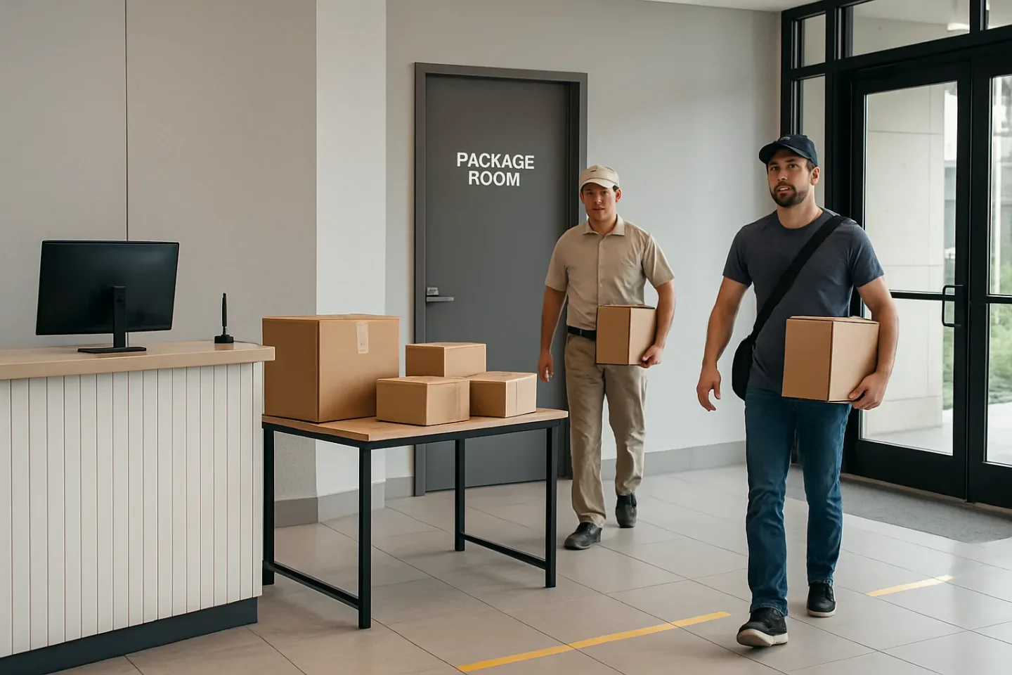
Misdelivery Heatmaps: Reduce Package Misdeliveries in an Apartment Building by Mapping Time + Door + Carrier
Most “missing package” tickets aren’t random. They’re patterns hiding in plain sight: the same 90-minute rush, the same confusing entrance, the same overflow shelf, the same handoff gap. When you treat every complaint as a one-off, you end up in endless back-and-forth with residents and carriers. When you treat complaints as signals, you can reduce package misdeliveries in an apartment building without picking fights or writing long emails to stations you can’t control.
introParagraphs_endcap
For the next 14 days, you’re going to run a lightweight delivery error analysis that captures just enough operational detail to reveal where misdeliveries start. The method is simple: log three variables consistently, then visualize them as a heatmap (arrival time block + entry point + carrier type). Instead of arguing about what happened, you get an operational map that points to fixable friction: lobby door routing fixes, clearer cues, intake windows during peak drops, and staging zones that prevent “temporary” placements from becoming permanent losses.
This approach is especially effective for uncovering package room misdelivery root cause issues that feel invisible day to day: a side vestibule that becomes the default after 4 pm, a lobby desk that can’t see the package room door during lunch, or a “quick drop” shelf that turns into a black hole during the 10–1 rush. The goal isn’t to grade carriers. It’s to make the correct path so obvious (and the incorrect path so inconvenient) that errors stop repeating—and when you do need to share feedback, you can do it neutrally with evidence and one clear request.
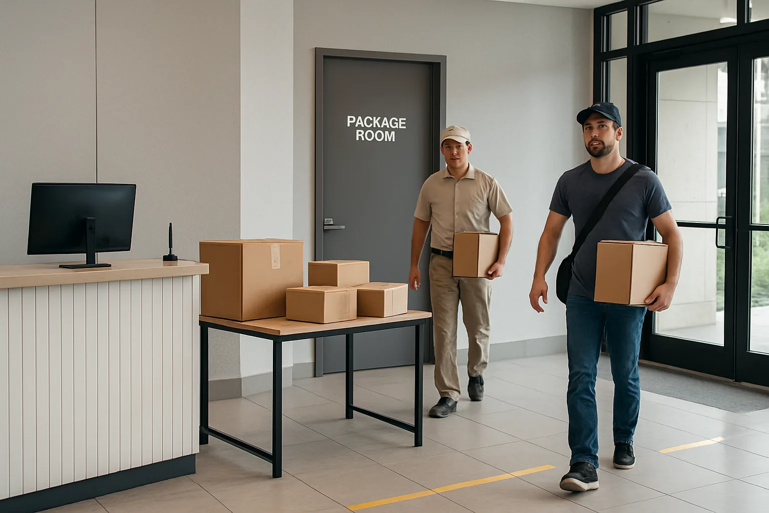
The Heatmap Mindset: Turn Complaints Into a Map (Time Block + Door + Carrier)
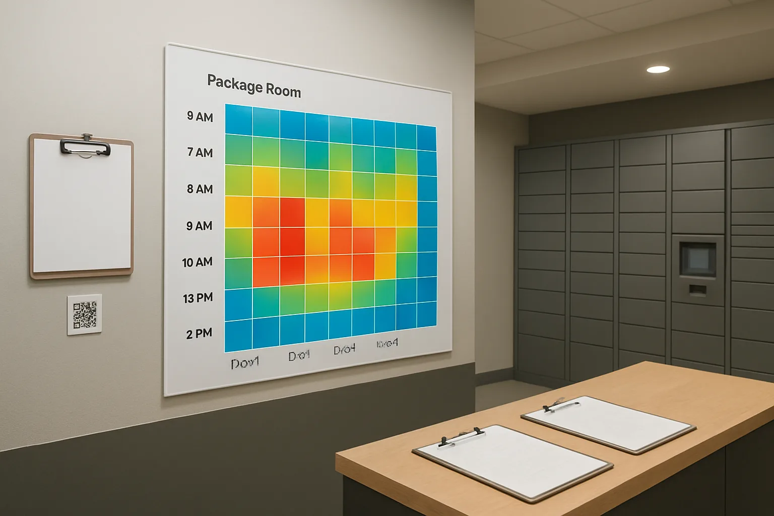
If your goal is to reduce package misdeliveries apartment building-wide, you will get further by treating every “missing package” ticket as a data point than by treating it as a one-off incident. A misdelivery heatmap is a simple way to convert complaints into an operational map that shows where errors concentrate across three practical dimensions: when the delivery arrived, which entry point was used, and what type of carrier made the drop.
paragraphs
In buildings, misdeliveries often look random because the symptoms show up later (a resident can’t find a package), while the cause happens earlier (a driver uses the wrong door, a drop happens during a coverage gap, or a package gets staged in the wrong zone). The heatmap compresses all that noise into a pattern you can act on: routing tweaks, clearer cues, better staging, and small intake process changes—without needing to accuse a specific driver or staff member.
Think of it as package room misdelivery root cause analysis that fits real operations. You are not building a perfect investigation. You are building a directional map that is “good enough” to prioritize fixes that remove ambiguity at the exact moments and places errors happen.
- A misdelivery heatmap is a grid that highlights hotspots by time block (arrival window) x door/entry point x carrier type.
- It supports delivery error analysis by shifting discussion from “who messed up” to “what conditions make mistakes more likely.”
- It points directly to fixable levers: lobby door routing fixes, signage and wayfinding, intake windows (when and where deliveries are accepted), and package-room staging zones.
- It helps you separate high-volume areas (many deliveries) from high-error areas (higher error rate), so you don’t chase the loudest complaint channel.
- It creates a neutral basis for carrier conversations and for internal coaching—focused on one environmental change at a time.
What counts as a “misdelivery” vs. “missing” (keep definitions consistent)
Before you map anything, standardize terms. Most buildings mix “missing,” “stolen,” “delayed,” and “misdelivered” into the same bucket, which makes patterns harder to see and can create friction with carriers and residents. The heatmap works best when your team uses the same labels consistently for two weeks.
Use simple definitions that match what staff can actually verify in the moment:
Misdelivery (for heatmap purposes): The package was delivered to the building but ended up in the wrong building location or workflow. Examples: left at the wrong door/vestibule; placed in the wrong package-room zone; dropped in lobby instead of package room; handed to concierge but not entered/staged correctly; delivered to the wrong tower/entrance within the same property; delivered to the mailroom instead of the package room (or vice versa). These are the events your layout, cues, routing, and intake steps can prevent directly. This is your primary heatmap category because it leads to repeatable operational fixes.
Missing: The package cannot be located and you cannot yet verify what happened. Treat “missing” as a temporary status, not a root cause. After a quick check (common shelves, exception bin, oversize area, misroute shelf, behind desk, other entrance), you either reclassify it as misdelivery (found in wrong place) or keep it as missing pending carrier proof of delivery and resident follow-up.
Not a misdelivery (keep out of the heatmap unless you track separately): carrier never delivered; delivery still in transit; resident picked up but ticket was filed anyway; package was delivered to a completely different address (true address error); confirmed theft after correct placement. You can still log these, but they should not drive routing/signage changes because the causes are different.
A practical rule: only put events into the heatmap if your building could realistically prevent the repeat through clearer routing, cues, staging, or handoffs. That keeps the analysis focused and reduces unproductive debates.
The three axes that reveal repeatable patterns
The point of a heatmap is to take every complaint and place it into a consistent coordinate system. You do not need perfect precision; you need consistent categorization. These three axes work because they align with what you can change in building operations:
1) Time block (arrival window): Use broad blocks (for example, morning, midday, afternoon, evening) rather than exact timestamps. Exact times are often missing or unreliable, but staff can usually identify the window based on shift notes, carrier patterns, or proof-of-delivery photos. Time blocks also reveal coverage gaps, queueing periods, and handoff moments—often the real source of “random” errors. This is where you’ll uncover carrier performance by time window in a way that’s actionable (e.g., “midday spike when lobby is busy,” not “a problem at 12:17”).
2) Door/entry point (where the delivery entered or was left): Doors are decision points. A single confusing vestibule or an “easier” side entrance can generate a large share of errors. Name entry points in a way anyone can pick consistently (Lobby Door A, Package Room Door, Loading Dock, Side Vestibule, Tower 2 Entrance). Door labeling matters because the goal is to identify which physical routing choice creates misdelivery risk—then remove that choice or make the correct route unmistakable. This axis is directly tied to lobby door routing fixes and wayfinding improvements that prevent repeats without added labor.
3) Carrier type (who is delivering, in broad categories): You do not need to identify individual drivers. The goal is to separate different delivery behaviors and constraints. A major carrier with a consistent route may respond well to a single posted instruction; gig/courier drivers may need simpler, more visible cues; USPS may follow a different access path. Keeping it at “carrier type” preserves neutrality, reduces defensiveness, and still allows you to spot patterns like “courier deliveries misroute at Side Vestibule in the evening.”
When you combine these axes, you get operational clarity. “We have misdeliveries” becomes “Midday + Side Vestibule + courier/gig” or “Evening + Lobby Door A + mixed carriers,” which immediately suggests what to change: routing, signage, staffing coverage, or staging zones.
Why this method reduces conflict: you change the environment, not the person
Misdelivery conversations often become confrontational because they start with blame: a resident blames the desk; the desk blames carriers; carriers blame unclear access; everyone is partially right. The heatmap mindset changes the frame from fault to conditions.
Instead of asking, “Who did this?” you ask, “What made the wrong action easy?” In most buildings, misdeliveries happen when the environment allows multiple interpretations: two doors that look equally valid, a package room that is hard to find, a staging area with no clear zones, or a busy window where staff can’t verify drop locations. These are design problems, not character problems.
This approach also makes interventions feel fair and professional. You are not singling out a person; you are improving a system. Common non-accusatory levers the heatmap points to include:
Routing: making one delivery path the default and visibly discouraging the wrong doors.
Cues: high-contrast instructions that match what a driver sees at speed (large text, consistent door names, simple “Deliveries Here” hierarchy).
Intake windows: shaping when bulk drops are accepted, or how after-hours deliveries are directed, to reduce pileups and unverified handoffs.
Staging zones: creating obvious “homes” (oversize, pending verification, exceptions) so packages don’t migrate and become “missing.”
The win is that you can reduce misdeliveries without confrontation: the building becomes easier to deliver to correctly. Then, if you do need to talk with a carrier, you can share a neutral map of conditions rather than an accusation—keeping the relationship cooperative and focused on one change at a time.
Set Up a 14-Day Data Capture That Front Desk and Residents Will Actually Use
The goal of this two-week capture is not perfect data. It is consistent, lightweight data that lets you run delivery error analysis without slowing package intake or turning your team into auditors. You are trying to reduce package misdeliveries apartment building-wide by making patterns visible: which time blocks, which doors, and which carrier types correlate with problems.
Design the capture so it takes 10–20 seconds per event and can be done during rushes. That means: fixed pick-lists (not free text), a small number of required fields, and two separate paths for data depending on whether you are logging deliveries or logging resident-reported issues.
Before day 1, do a 15-minute setup: print a one-page reference sheet (time blocks, door names, carrier categories), put it at the front desk and in the package room, and align your team on definitions. Consistency matters more than detail.
- Operating rule: if a field is hard to capture in the moment, do not collect it. Replace it with a category.
- Capture only what you can act on: time block, entry point, carrier type, and the outcome (normal vs. misdelivered/needs correction).
- Use the same labels everywhere (desk log, ticket tags, signage) so you can match issues back to conditions.
- Keep resident input optional and guided: give them a small set of location names to choose from instead of asking for narratives.
Choose your time blocks (keep them fixed for all 14 days)
Pick time blocks that match how your building actually experiences delivery pressure and staffing. The easiest approach is four blocks that cover your main day, plus an after-hours bucket if it matters.
Example time blocks that work in many properties: 7–10, 10–1, 1–4, 4–7, and After hours (7–7). If your site is high-volume early morning (dock drops, concierge start), shift earlier. If you see evening retail and food deliveries, include 7–10pm.
Rules for time blocks: (1) do not change them mid-cycle, (2) use the time the delivery was first observed at the building (not when it was sorted), and (3) if uncertain, pick the best block and move on—do not stop intake to investigate timestamps.
Standardize door and entry-point names (make them unambiguous)
Most misdelivery arguments start with vague location language: front door, main entrance, mailroom, concierge, side door. Your heatmap will only work if everyone uses the same entry-point names.
Create a short list of 3–6 entry points and give each a simple, bold name that matches signage. Examples: Lobby Door A, Package Room Door, Loading Dock, Side Vestibule, Garage Entry, Leasing Office.
Rules for entry points: (1) one physical door equals one name, (2) avoid directional names that change depending on where you stand (left door/right door), (3) if deliveries are sometimes left outside a door, treat Outside Lobby Door A as its own entry point rather than mixing it into Lobby Door A. This is often where your biggest preventable errors hide.
Carrier type categories that stay useful (don’t overfit)
You are not trying to grade individual drivers. You are trying to see whether a type of delivery operation behaves differently in your environment—especially by time window.
Use carrier type categories that staff can select instantly, even when uniforms and vehicles are inconsistent. A practical set: Major carrier (UPS/FedEx/DHL-type), USPS, Gig/courier (independent, on-demand, local courier), Food/retail (restaurant, grocery, big-box same-day), Building/vendor (maintenance parts, linen, etc.), Unknown.
Rules for carrier type: (1) when in doubt, choose Unknown rather than guessing, (2) do not create a new category mid-cycle, (3) if you later find one “Unknown” source is common, keep it Unknown for this cycle and add a new category next cycle. Two weeks is about clarity, not completeness.
Two simple capture paths: intake log vs. ticket log
To keep friction low, separate the two ways problems surface: what staff sees during intake and what residents report later. You need both because many misdeliveries are invisible at drop-off but obvious at retrieval.
Path 1: Intake log (staff-facing). Use it for any delivery interaction the desk, concierge, or package room attendant touches: bulk drops, handoffs, redirected drivers, or anything placed in a controlled room. Staff records one line per delivery batch or per exception event (not necessarily every single package).
Path 2: Ticket log (resident-facing or support-facing). Use it for missing package tickets, wrong-location reports, and “delivered but not found” claims. This can be your existing ticketing system, but add three required tags: time block (when the carrier marked delivered if known, otherwise when resident noticed), entry point (resident chooses from your standardized list), and carrier type (if known). If your system cannot enforce tags, use a simple triage checklist at the desk and apply tags when the ticket is created.
Minimal fields to collect (and what to skip to avoid burnout)
Your minimum viable dataset should let you answer: What happened, when did it happen, where did it happen, and who brought it (at the category level)? Everything else is optional.
Recommended required fields for the intake log (10–20 seconds): Date, Time block, Entry point, Carrier type, Event type (Normal drop, Redirected to correct door, Left outside/Unattended, Could not access, Overflow), Volume indicator (1–5, 6–20, 20+), Staff initials.
Recommended required fields for the ticket log (triage level): Date opened, Time block (estimated is fine), Entry point last checked (standard list), Carrier type (or Unknown), Issue type (Not found, Wrong door, Wrong shelf/zone, Delivered to unit/neighbor, Marked delivered early), Resolution (Found in building, Returned/re-delivered, Refund/claim, Still open).
Template: one-page intake log (paper or shared sheet)
Use a paper clipboard during rushes and transcribe once per day, or use a shared spreadsheet on a desk tablet—either is fine as long as the fields are fixed pick-lists. Below is a simple structure you can copy into any spreadsheet:
Intake log columns: Date | Time block | Entry point | Carrier type | Event type | Volume (1–5/6–20/20+) | Notes (optional, max 10 words) | Staff initials.
Notes should be truly optional and short. If staff start writing stories, the log will fail. Reserve notes for unusual exceptions like “door buzzer down” or “package room full.”
What to skip (common time-wasters that don’t improve the heatmap)
Skip package-level tracking numbers, recipient names, and photo attachments as required fields. Those create privacy concerns, slow intake, and rarely improve pattern detection across doors and time blocks.
Skip driver names and vehicle descriptions. The method is designed to reduce conflict; collecting personally identifiable driver information pushes the process toward blame and is hard to keep accurate.
Skip exact timestamps unless you already have them automatically. Time blocks are intentionally coarse so you can capture reliably under pressure.
How to handle QR-label or photo proof without adding new tech requirements
If you already use QR labels internally (for package room organization, resident pickup, or chain-of-custody), leverage them as optional evidence—not as a required step that slows the line.
Simple approach: add a checkbox field to the intake log called “Evidence available” with options: QR label applied, Photo on file, Carrier photo exists, None/Unknown. Staff only checks the box; they do not need to attach anything during intake.
If a resident shows a carrier delivery photo, do not try to store it in a new system. Instead, record one standardized note in the ticket log: “Carrier photo shows: Lobby Door A / Package Room Door / Unknown.” This keeps your heatmap focused on place and process, not file management.
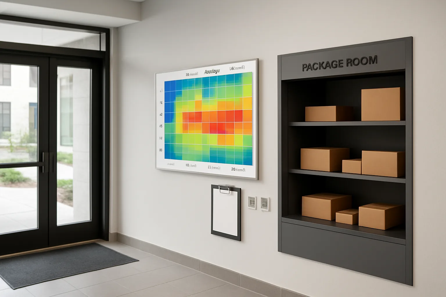
Build the Misdelivery Heatmap in a Spreadsheet (No Special Tools Required)
You do not need a dashboard tool to do delivery error analysis well. A basic spreadsheet can show you exactly where to focus to reduce package misdeliveries apartment building-wide: which time blocks, which doors, and which carrier types are producing repeat problems.
The key is to build two views from the same 14-day log: (1) a simple count heatmap (how many misdeliveries happened) and (2) a rate heatmap (misdeliveries relative to delivery volume). Counts tell you where the pain is; rates tell you where the process is broken.
Before you start, make sure your log has these columns (names can vary): Date, Time Block, Door/Entry Point, Carrier Type, Event Type (Delivery or Misdelivery Ticket), and a Package ID or short descriptor (tracking last 4, QR label ID, or photo filename). Keep it consistent—your heatmap is only as clean as your labels.
- Goal for this step: identify the top 3 hotspots (highest error rate) and the “quiet hours” that perform well so you can copy what works.
- Tools: Google Sheets or Excel; pivot tables; conditional formatting (color scale).
- Output you want: two heatmaps (Counts and Rates) plus a short hotspot list you can act on.
Create a pivot table: counts by time block x door x carrier
Start with the simplest question: where are misdeliveries clustering? Build a pivot table that counts misdelivery events by Time Block, Door/Entry Point, and Carrier Type. This gives you the first draft of your package room misdelivery root cause map.
Step-by-step (works similarly in Sheets and Excel):
1) Put all rows (deliveries and misdeliveries) into one sheet called Raw Log. Do not leave blank rows. Ensure Time Block, Door, and Carrier Type use your standardized names (for example: 7–10, 10–1, 1–4, 4–7; Lobby Door A, Package Room Door, Loading Dock; Major Carrier, USPS, Gig/Courier, Retail/Food, Unknown). 2) Insert a pivot table from Raw Log. 3) Filters: set Event Type = Misdelivery (or Ticket) so the pivot only counts misdelivery events. 4) Rows: Door/Entry Point. 5) Columns: Time Block (or swap: Time Block as rows if that reads better). 6) Values: Count of Package ID (or Count of rows). 7) Optional “slice”: add Carrier Type as a second level in rows (Door then Carrier) or as a pivot filter you can toggle to compare carrier performance by time window.
Add a denominator: deliveries per cell to see “error rate,” not just “error count”
Counts alone can mislead you. A door with heavy volume can have the most complaints even if it is performing fine. To pinpoint what actually needs changing, add a denominator: deliveries per Door x Time Block x Carrier Type cell, then compute an error rate.
Practical approach without over-engineering: build two pivots and a simple rate table.
1) Pivot A (Misdeliveries): the pivot you built above (Event Type = Misdelivery) showing counts by Door x Time Block (and optionally Carrier Type). 2) Pivot B (Deliveries): duplicate Pivot A, but set Event Type = Delivery (or Intake) so it counts total deliveries in the same cells. 3) Rate table: in a new sheet, mirror the layout of Pivot A, then compute Rate = Misdeliveries / Deliveries for each matching cell. If a cell has zero deliveries, leave the rate blank (do not treat it as 0%—it is “no data”). 4) Format as percent and apply conditional formatting color scale (for example: green low, yellow medium, red high). This is your true misdelivery heatmap: a quick way to see where routing, signage, or handling is failing, not just where volume is highest.
Flag the top 3 hotspots and the “quiet hours” that perform well
Once you have the rate heatmap, pull out a short, decision-ready list. You are looking for (a) the highest error rates with enough volume to matter, and (b) the lowest error rates that represent a process worth copying.
A lightweight way to do this:
1) Create a small summary table with these columns: Door, Time Block, Carrier Type (if used), Misdeliveries, Deliveries, Error Rate. 2) Sort by Error Rate (descending). 3) Apply a minimum-volume rule so you do not chase noise (example rule: only consider cells with at least 10 deliveries in the 14-day window, or whatever threshold makes sense for your building volume). 4) Mark the top 3 as Hotspots. 5) Sort by Error Rate (ascending) and mark 2–3 Quiet Hours (cells with low rate and meaningful volume). These quiet cells are useful: they suggest the door signage is clearer at certain times, staffing coverage is better, or carriers are naturally routed correctly—clues you can replicate through lobby door routing fixes and intake practice.
Sanity checks: false positives, duplicate tickets, resident pickup delays
Before you act, make sure your heatmap is not reflecting logging artifacts instead of real misdeliveries. A few quick checks prevent you from “fixing” the wrong thing.
1) Duplicates: scan for repeated Package IDs or identical complaint entries filed by multiple staff members. De-duplicate so one event equals one misdelivery. 2) False positives: confirm whether some tickets were actually “not yet picked up” (resident expectation issue) rather than a true misdelivery. If your process includes a pending verification shelf or exception bin, make sure tickets tied to those were resolved correctly and not counted twice. 3) Time stamp drift: confirm your Time Block is based on when the package arrived (or was logged), not when the resident reported it. Resident report time can shift complaints into the wrong window and distort carrier performance by time window. 4) Door naming mistakes: look for near-duplicates like “Lobby A” vs “Door A.” Clean these up and refresh the pivot so the signal is not split across two labels. 5) Access/holding patterns: if deliveries are staged in a vestibule or temporarily held at the front desk during busy periods, you may see a spike that is really a handoff gap. Note those days separately so you do not over-attribute issues to a carrier type.
Diagnose Root Cause by Hotspot Type: What the Heatmap Is Really Telling You
A heatmap is only useful if it leads to a decision. The goal is not to “prove” who made a mistake; it’s to identify which conditions predict mistakes so you can change the conditions. When you’re trying to reduce package misdeliveries apartment building-wide, the fastest wins usually come from fixing a repeatable flow problem: where the carrier entered, what was happening in the lobby/package room at that time, and how easy it was to choose the correct drop location.
The most common misreads happen when teams look only at “who” (carrier) and skip “when” and “where.” Your heatmap gives you all three, so you can separate true carrier performance by time window from issues like staffing gaps, door confusion, overflow, or poor visibility. Use the patterns below as a package room misdelivery root cause guide: match the shape of the hotspot, make a short hypothesis, then validate it with a quick observation before you change procedures. That keeps your delivery error analysis grounded and avoids knee-jerk rule changes that add work but don’t reduce errors.
- Decision rule: treat a hotspot as a systems problem until a 10-minute observation proves otherwise.
- Prioritize hotspots that combine high error rate and high volume; those produce the most “missing package” tickets per week.
- Look for “mirrors”: if one door/time window is hot but another is consistently quiet, the difference often reveals the fix (visibility, staffing, or routing).
Pattern 1: One carrier spikes in one window (carrier performance by time window vs. staffing coverage)
What it looks like on the heatmap: One carrier category lights up in a specific block (for example, 10–1), while other carriers in the same time window are normal. Or that carrier is fine most of the day but spikes right when the building is busiest.
What it often means: This is frequently misattributed to “that carrier is careless.” In practice, the top drivers are (1) a mismatch between that carrier’s arrival rhythm and your coverage, (2) a recurring access problem they solve by choosing the path of least resistance, or (3) a bulk-drop behavior that overwhelms your normal intake flow. If the spike aligns with desk breaks, tours, or package-room congestion, you’re seeing a timing and capacity issue, not a person issue.
Operational hypotheses to test: (a) Deliveries arrive when the desk is temporarily unattended, so packages get staged informally and later misfiled; (b) the package room is at capacity during that window, causing overflow to “temporary” surfaces; (c) the carrier arrives during resident traffic peaks and avoids the correct route; (d) the carrier is using a different entry point during that window because of access delays or a propped door. This pattern is where “carrier performance by time window” is most likely to actually be “building performance by time window.”
Pattern 2: All carriers spike at one door (signage/wayfinding and door hierarchy problems)
What it looks like on the heatmap: The door/entry-point column is hot across multiple carriers and multiple time blocks. The carrier mix changes, but the same door keeps producing misdeliveries.
What it often means: This is almost always a routing and cues problem. If every type of driver makes the same mistake, the environment is teaching the wrong behavior. Common causes include: two doors that look equally “official,” unclear naming (staff calls it Package Room Door but the sign says Deliveries), intercom directories that send drivers to the wrong vestibule, or a door that is simply closer to the curb and therefore “wins” under time pressure.
Operational hypotheses to test: (a) The “wrong” door is the easiest door (closest parking, easiest access, fewer steps); (b) signage conflicts or is too small/too wordy to read while carrying parcels; (c) the correct door is sometimes locked or slower (access control delays), training drivers to use the alternative; (d) the drop location is not visible from the point of entry, so drivers improvise. When this pattern appears, focus on lobby door routing fixes first, because changing the door hierarchy often reduces errors without requiring anyone to learn a new process.
Pattern 3: Errors cluster at shift changes or lunch (handoff, checklist gaps, unattended vestibules)
What it looks like on the heatmap: A thin but consistent band of errors appears around the same time daily, often overlapping internal transitions (for example, 12–1 or 4–5). The “door” may vary, but the time block is reliably problematic.
What it often means: This is a handoff failure disguised as a delivery problem. During transitions, packages get placed “temporarily,” photos don’t get matched to a location, QR-labels don’t get applied to a portion of the drop, or the lobby becomes a staging area because no one is actively directing flow. Misdeliveries increase because accountability becomes fuzzy for 20–40 minutes.
Operational hypotheses to test: (a) A desk coverage gap leaves carriers to self-route; (b) staff doing a handoff focuses on residents and defers package intake; (c) carts and shelves fill up, pushing overflow into ambiguous zones; (d) a vestibule or mailroom door is propped during the transition and becomes an unmonitored drop point. If your goal is to reduce package misdeliveries apartment building-wide, this is one of the highest-leverage patterns because a 30-second checklist and a hard boundary on “temporary staging” can eliminate a large portion of repeat errors.
Pattern 4: Weekend or evening spikes (access control and resident traffic interference)
What it looks like on the heatmap: Errors are relatively low during weekday business hours, but weekends, evenings, or late delivery windows are consistently hot. Door hotspots may shift to the lobby or side vestibule, and “unknown” carrier types may increase (gig/courier, retail, food).
What it often means: After-hours conditions change the rules: fewer staff, locked internal doors, different intercom behavior, and more resident movement through common areas. Drivers may tailgate residents, follow someone else’s gesture, or drop packages where they can exit quickly. Even when a package is technically delivered, it can be effectively “misdelivered” operationally if it bypasses your standard intake and ends up outside your tracking or normal storage zones.
Operational hypotheses to test: (a) Access control forces drivers to leave items at the first door they can reach; (b) residents prop doors during move-ins, parties, or garbage runs, creating a “new” entry route; (c) the package room is locked and the fallback instruction is unclear; (d) resident traffic makes the correct drop-off area feel “in the way,” so drivers choose a corner or bench. This is often solved with simplified after-hours routing cues and a single, obvious fallback location—not by asking every weekend driver to learn your full weekday procedure.
Quick confirmation steps: 10-minute observations that validate the hypothesis
Before you redesign signs or change routing rules, validate the hotspot with a short, low-drama observation. You’re looking for confirmation that the environment is creating the behavior your heatmap suggests. Do this once or twice per top hotspot (two short sessions beats one long stakeout).
Keep the observation objective: write down what you see, not what you think the driver “should” have done. This makes later carrier conversations factual and helps your team agree on the real package room misdelivery root cause instead of debating anecdotes.
Fixes That Don’t Accuse Anyone: Routing, Cues, Intake Windows, and Staging Zones
Once your heatmap highlights the repeat offenders (a door, a time block, a carrier type), the goal is not to “catch” anyone doing it wrong. The goal is to redesign the environment so the correct drop-off path is the fastest, most obvious path—especially during rush windows. These fixes work because they reduce decision-making for drivers and remove ambiguity for staff.
Treat this as a kit of small, reversible changes. Implement one or two per hotspot, then re-check the hotspot in your next 14-day cycle. If you’re trying to reduce package misdeliveries apartment building-wide, you’ll get more mileage from a few high-leverage cues than from broad policies no one can remember.
- Principle: Make the correct route unavoidable (or at least easier than the wrong one).
- Principle: Use large, consistent naming (Door A, Package Room Door) everywhere—signs, tickets, staff language.
- Principle: Create a visible “exception path” so misroutes don’t get mixed into normal shelves.
- Principle: Protect peak windows with batching and micro-checklists, not extra meetings.
Door routing fixes: close the wrong door to deliveries, re-label entrances, add “Delivery Use This Door” hierarchy
If your heatmap shows errors concentrating at one entry point, fix the door decision first. Most misdeliveries start with a driver entering the “almost right” door—leasing vestibule, resident-only side door, or a lobby door with unclear instructions—then dropping packages where they first find open space.
Start by declaring a single primary delivery door (even if multiple doors exist). Then reinforce that choice with both physical routing and language routing (staff and residents using the same names).
Practical options that don’t require confrontation: (1) reduce the number of doors that appear “available” for deliveries, (2) increase the clarity of the correct door, (3) make the wrong door slightly harder or less rewarding (no empty tables, no convenient corners).
Cue upgrades: floor arrows, color zones, big-letter carrier-specific instructions
When volume spikes, drivers stop reading paragraphs. They follow big shapes, high-contrast words, and anything that looks official and consistent. Your cues should be visible at walking speed, from a distance, and from the driver’s approach angle (not just from inside the package room).
Aim for a three-layer cue system: (1) a “you are here / use this door” cue outside, (2) a “go this way” cue in the lobby/vestibule, and (3) a “put it here” cue at the final drop point. That combination prevents the classic failure mode: driver makes it to the right area, then chooses the wrong surface or shelf.
Carrier-specific instructions can be helpful, but only if they don’t create a maze. Keep them limited to the final step (where to place items) rather than the entire route (which should be the same for everyone).
Package room staging zones: oversize area, pending verification shelf, exception bin, misroute shelf
Many package room misdelivery root cause patterns aren’t about “wrong building”—they’re about wrong placement inside the correct room. During rush windows, anything that doesn’t have an obvious home becomes a future ticket.
Create a simple zoning layout that gives every package a first landing spot. The goal is to prevent drivers (or staff) from improvising, because improvised placement is exactly what residents experience as “missing.”
A practical zone set that works in most buildings: (1) Oversize area, (2) Pending verification shelf, (3) Exception bin, and (4) Misroute shelf. These zones turn messy edge cases into a controlled workflow without slowing down the normal flow.
Intake windows and batching: when to accept bulk drops vs. when to redirect
Heatmaps often show that the building performs well in quieter windows and falls apart during predictable peaks. Instead of trying to “staff harder,” use intake rules that protect your busiest moments.
Batching is not refusing deliveries; it’s setting a consistent, repeatable process for high-volume drops. For example: during your hottest time block, you may accept bulk drops only at the package room door and only onto a designated staging zone. Anything arriving at the wrong door gets redirected to the correct door (with a friendly sign and consistent staff language).
If your operation includes a front desk handoff, define a short list of conditions when staff should not break away from resident-facing duties (e.g., during check-in rush) and instead route drivers to the package room landing zone. That reduces the half-attended, half-documented handoffs that generate tickets later.
Front desk micro-checklists: 30-second handoff and end-of-shift sweeps
Shift changes and lunch coverage frequently show up as hotspots because accountability gets blurry—packages sit in transitional spaces, or a handoff happens verbally with no shared mental model of what “done” means.
Micro-checklists work because they compress quality control into seconds, not minutes. You’re not adding bureaucracy; you’re preventing a handful of repeatable mistakes that create the most resident frustration.
Use two checklists: a 30-second handoff checklist that standardizes what “received” means, and an end-of-shift sweep that clears transitional surfaces (lobby tables, back counter, vestibule floor). The sweep is especially effective because it removes the temptation for drivers to leave items in the first visible spot.
Resident-facing tweaks that reduce noise without blaming (pickup reminders, clear location names)
Some “missing package” tickets are timing mismatches or location misunderstandings: the package is in the building, but the resident expects a different room name, door, or shelf scheme. Fixing those reduces ticket volume and makes true misdeliveries easier to see.
Keep resident comms operational, not accusatory. Replace vague language (“check the package room”) with consistent location names that mirror your signage (“Packages are in Package Room Door A” or “Oversize is on the Oversize Rack”).
Two low-drama tweaks: (1) pickup reminders that name the exact location (especially for oversize and refrigerated items), and (2) a short “where packages go” note for new residents that uses the same door labels and zone names as your heatmap. The result is fewer false alarms and a cleaner signal for your delivery error analysis.
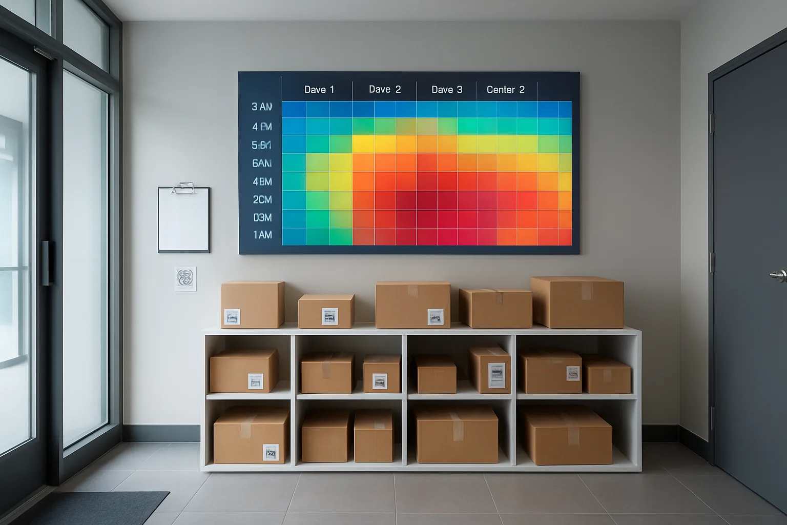
Carrier Feedback Without Confrontation: A Short Script + Follow-Up Loop
Once you have a heatmap, the goal is not to “catch” a driver doing something wrong. The goal is to reduce package misdeliveries apartment building-wide by making the correct drop-off path obvious and consistent—then confirming carriers are aligned with it. The most effective carrier conversations are short, specific, and framed as a building-operations update, not a performance critique.
When you keep the conversation evidence-based (time window + door + carrier type) and pair it with a simple environmental fix (signage, routing, staging zones), you can address the package room misdelivery root cause without escalating conflict. Think of the heatmap as a shared troubleshooting tool: it shows where friction happens so you can remove it.
- Keep it neutral: “We’re seeing confusion at Door B between 4–7pm” works better than “Your drivers keep misdelivering.”
- Ask for one change at a time. Two or three requests at once usually fails in the field.
- Tie the request to an easy cue: a single door name, a color zone, a “place here” shelf label.
- Make compliance the path of least resistance: if Door A is the correct entrance, it must be the easiest to access and the most clearly marked.
- Close the loop with the same method you used to detect the problem: a small, repeatable delivery error analysis cycle (monthly mini-heatmap).
How to present the heatmap as an operations aid, not a report card
Open with the building’s objective: fewer resident tickets and fewer re-deliveries for everyone. Then share only what’s necessary: one hotspot and the operational change you’re making to remove ambiguity (a routing change, a sign, a staging zone).
Keep the focus on conditions, not intent. Use language like “when the lobby is busy,” “when the package room door is locked,” or “when the vestibule is unattended,” which naturally leads to environmental fixes and avoids blaming individuals.
If you’re comparing carriers or discussing carrier performance by time window, avoid rankings. Instead, describe patterns in terms of volume and context: “Most of our late-day volume hits between 4–7pm, and that is also when Door B drop-offs spike.” That positions the data as situational and solvable.
The 60-second script for drivers, dispatch, or station contacts
Use this script verbatim or adapt it. The structure matters: appreciation, the observed pattern, the building change, one request, and confirmation.
Script (driver at the door):
“Hi—quick ops update so deliveries go smoother here. Over the last two weeks we noticed a repeat issue in the late afternoon where packages are being left at Door B instead of the package room drop. We’re updating signage today to make it clearer. Could you help us by using Door A for all package drops and placing them in the Zone 2 shelves inside the package room? If Door A is blocked, please call the desk number on the sign rather than leaving items in the vestibule. Thanks—this cuts down resident ‘missing package’ tickets and prevents re-trips for you.”
One-change requests that work (use Door A, scan at package room, place on Zone 2 shelves)
The heatmap tells you where to focus, but the request must be simple enough to survive real delivery conditions. Choose the smallest behavior change that interrupts the hotspot pattern.
Good one-change requests are unambiguous, physically easy, and tied to something carriers can see immediately. If you ask for scanning, placement, and door choice simultaneously, you will get inconsistent compliance—pick the one lever most likely to reduce the error rate in that cell of your heatmap.
Documenting agreements: one-page “delivery notes” sheet at the entrance
Verbal alignment fades quickly because routes rotate. Put the agreement where the decision happens: at the entry point. A single-page “Delivery Notes” sheet (printed, protected in a sleeve, taped at eye level) prevents the building from relying on memory or individual relationships.
What to include on the sheet (keep it short):
– Where to go: “All packages: Door A → Package Room” (use your standardized door names)
– Where to place items: “Zone 2 shelves” / “Oversize area” / “Exception bin”
– What not to do: “Do not leave items in lobby/vestibule”
– If access fails: “Call desk at [number]” or “Use call box code [x]”
– Hours or batching rule if you have one: “Bulk drops accepted 10–1; outside that window, use Zone 2 and do not block the entry”
– A date stamp: “Updated [date]” so carriers see it is current
Keep this aligned with your internal labels (Door A, Zone 2) so your signage, staff language, and ticket notes all match. Consistent naming is a quiet but powerful lobby door routing fix.
Close the loop: rerun a mini heatmap monthly and retire fixes that no longer matter
Carrier alignment is not a one-time project. Routes change, staffing changes, and seasonal volume shifts will move your hotspots. Build a lightweight follow-up loop so you can confirm improvement without constant confrontation.
A simple cadence that works in practice:
– Week 1 each month: pull the last 14 days of the same minimal fields and rebuild the heatmap table
– Identify: the top 1–2 hotspots by error rate (not just count)
– Adjust: one environmental change (signage/routing/staging) and one carrier-facing request if needed
– Verify: compare the hotspot cells in the next cycle; if the rate drops and stays low, keep the fix but stop discussing it
Also retire fixes that no longer matter. If Door B stopped being a hotspot for three consecutive cycles, remove extra signage that adds clutter and confusion. The goal is a calm, minimal set of cues that consistently reduces package misdeliveries apartment building-wide—supported by periodic, factual delivery error analysis rather than ongoing escalations.
Frequently Asked Questions
What is a “misdelivery heatmap,” and why does it help reduce package misdeliveries apartment building teams deal with daily?
A misdelivery heatmap is a simple table that shows where delivery errors concentrate across three variables: arrival time block, entry point (door), and carrier type. Instead of treating each “missing package” ticket as a one-off complaint, you treat them as signals that point to repeatable operational conditions.
Why it works:
– Time blocks reveal staffing and traffic effects (rushes, shift changes, lunch gaps).
– Door/entry points reveal wayfinding and access-control confusion (carriers choosing the easiest door, not the correct door).
– Carrier type reveals instruction fit and workflow mismatch (some carriers follow building notes; some rotate drivers or use gig couriers who never saw them).
The goal is not to “catch” anyone. It’s to change the environment so the correct behavior is the easiest behavior. That’s how you reduce package misdeliveries apartment building operations see—without escalating conflict with drivers, residents, or your own staff.
How should we define “misdelivery” vs “missing package” so our logs stay consistent for delivery error analysis?
Pick definitions your front desk (and residents) can apply in seconds. Consistency matters more than perfection.
A practical set:
– Misdelivery: The package was delivered, but ended up in the wrong place (wrong door/vestibule, wrong shelf/zone, wrong building/entrance, wrong unit cluster, or left outside the controlled area). It may be recoverable.
– Missing: The package cannot be located after a quick check of known misdelivery spots and logs. You do not know whether it was misdelivered, stolen, or never arrived.
– Resident delay (not an error): The item is in the correct location, but the resident hasn’t found it yet (often due to unclear location naming like “package room” vs “mail room” vs “locker area”).
Operational rule: Log the first two as “errors.” Log resident delay separately so your heatmap doesn’t accuse doors, times, or carriers for communication issues.
What’s the minimum data we need for a 14-day capture that won’t burn out the front desk?
Keep it to a “minimum viable record” that supports a package room misdelivery root cause analysis. If it takes more than 10–15 seconds, it won’t stick.
Recommended minimal fields (per error incident, not per package):
– Date
– Time block (example: 7–10, 10–1, 1–4, 4–7)
– Entry point where it was found or likely entered (Lobby Door A, Package Room Door, Loading Dock, Side Vestibule)
– Carrier type (UPS/FedEx/Amazon/USPS; or “Major carrier,” “USPS,” “Gig/courier,” “Retail/food,” “Unknown”)
– Error type (wrong door, wrong zone/shelf, left outside controlled area, wrong building)
– Resolution (found and routed, resident confirmed, escalated to carrier, still missing)
What to skip:
– Driver name (rarely available; creates blame)
– Package value or contents
– Long narratives
Two easy capture paths:
– Intake log (for staff): when staff finds a misrouted drop, they log it immediately.
– Ticket log (for residents): when a resident reports a missing package, staff logs the same minimal fields based on what is known.
If you already use QR labels or photo proof, you don’t need new tech. Just add one checkbox: “Has photo/label reference?” and store the reference where you already do.
How do we build the heatmap in a spreadsheet without misleading ourselves with “big counts” during high-volume hours?
The most common mistake is using counts instead of rates. High-volume windows will always “look worse” if you don’t normalize.
Basic build steps:
1) Create a table of errors (each row is one misdelivery or confirmed delivery error).
2) Create a separate table of delivery volume by time block x door x carrier type (this can be a quick tally each day, not perfect).
3) Make a pivot table for error counts: rows = time blocks, columns = doors (or doors nested under carrier types).
4) Add the denominator (delivery volume) to compute an error rate per cell.
Example of the rate concept:
– Door A / 10–1: 12 errors sounds bad, but if 1,200 packages arrived, that’s 1%.
– Side Vestibule / 4–7: 4 errors sounds small, but if only 40 packages arrived, that’s 10%.
Sanity checks before you act:
– Remove duplicate resident tickets (multiple emails about the same package).
– Confirm “late scan” situations (USPS marked delivered but arrived next day).
– Separate “resident delay” from true errors.
This simple approach turns your delivery error analysis into something you can confidently present to staff and carriers as a process map, not an accusation.
What patterns should we look for to understand carrier performance by time window vs a building workflow problem?
Use the shape of the hotspots to decide what to fix.
Pattern cues:
– One carrier spikes in one time block: Often a staffing coverage mismatch (that carrier arrives during lunch/meeting/shift change), or that carrier’s typical drop size overwhelms your intake flow.
– Likely fixes: adjust intake windows, add a 30-second handoff checklist during that window, create a “bulk drop staging zone.”
– All carriers spike at one door: Usually a routing/wayfinding issue. The door may be physically closer, more visible, or propped open.
– Likely fixes: lobby door routing fixes (make the correct door the obvious door), better hierarchy signage, temporarily closing the wrong door to deliveries.
– Errors cluster at shift changes: A handoff gap (packages moved but not logged; exceptions left in a temporary pile).
– Likely fixes: end-of-shift sweep, exception bin, and a single “pending verification” shelf.
– Evening/weekend spike: Access control and resident traffic interference (tailgating, vestibule piles, carriers unable to enter package room).
– Likely fixes: clear after-hours delivery notes, a designated secure drop zone, and resident messaging that reduces crowding.
Quick confirmation: Do two 10-minute observations during the hotspot window. Watch which door carriers choose, what they can see from the threshold, and where the first “flat surface” is (that surface becomes the default drop point unless you redesign cues).
What are non-accusatory fixes we can implement fast, and what’s a calm script for carrier feedback?
Fast, low-drama fixes focus on routing and cues—changing the path and the default behaviors.
High-impact fixes you can implement quickly:
– Door hierarchy: Put “Deliveries: Use Door A” in big lettering at decision points (parking entrance, lobby vestibule, and the wrong door). If possible, temporarily disable delivery access at the wrong door during hotspot hours.
– Visual routing cues: Floor arrows or colored tape leading to the correct drop zone. Make the correct route obvious from 10–15 feet away.
– Staging zones: Label shelves/areas by function, not staff jargon:
– Oversize
– Pending verification (needs unit match)
– Exception bin (wrong building/unknown unit)
– Misroute shelf (items found at wrong door)
– Intake windows/batching: During known bulk windows, accept drop-offs in a defined spot first, then scan/sort in batches to prevent a pile from forming in the doorway.
– Micro-checklists: A 30-second handoff checklist and an end-of-shift sweep prevent “temporary piles” from becoming “missing packages.”
A non-confrontational 60-second script (driver, dispatch, or station contact):
– “We’re seeing repeat delivery errors at our building, and we mapped them by time window and entry point so we can fix the environment. The highest-error spot is [Door/Time]. We’re updating signage and routing so the correct path is clearer.”
– “One request that would prevent most of these: please deliver through [Door A] and place packages in [Zone 2 shelves / labeled staging area].”
– “We’ll keep the notes posted at the entrance and we’ll review in two weeks to confirm the change reduced repeats.”
Follow-up loop:
– Post a one-page “delivery notes” sheet at the entry point.
– Re-run a mini 7–14 day heatmap monthly (or after layout changes).
– Retire fixes that no longer matter and focus on the next hotspot—small iterations beat big confrontations.
Next step: Run your 14-day heatmap cycle
Start today with a simple log that captures arrival time block, entry door, and carrier type—then commit to acting on the top three hotspots with signage, routing, intake timing, and staging zones. If you need to talk to a carrier, bring the heatmap and make one neutral request tied to a door and a placement zone.
From Heatmap to Fewer Tickets: Keep the Fixes, Drop the Drama
A misdelivery heatmap works because it replaces guessing with repeatable signals. In two weeks, you can see whether the problem is carrier performance by time window, an entrance hierarchy that’s unclear, a staffing coverage gap at predictable times, or a staging/layout issue that tempts “just set it there” decisions. Once you can point to the hotspot cell (time block + door + carrier type), you can choose a fix that doesn’t accuse anyone: route deliveries to one door, upgrade wayfinding cues, add a simple intake window during peak drops, and build staging zones that separate normal flow from exceptions.
The win is operational calm: fewer missing-package tickets, fewer resident escalations, and fewer tense conversations with drivers. Run the 14-day cycle, implement 1–3 changes, then do a small monthly refresh (even 3–5 days) to confirm the hotspot moved or disappeared. If a fix no longer matters, retire it; if a new pattern appears, treat it like a solvable map problem—not a blame problem.