
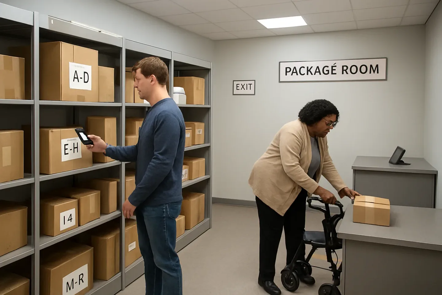
Accessibility-First Mailroom Operations: ADA Package Room Best Practices for Labels, Signage, and Retrieval Flow
Package rooms fail in predictable ways: residents cannot find the right shelf, staff get pulled into repeated “walk-and-search” escorts, and mis-shelved parcels quietly stack up into complaints. The fastest way to reduce that friction is to treat accessibility as an operations design tool, not a poster on the wall. When labels and signage work for low vision, seniors, and mobility needs, they also work better for everyone during peak delivery surges, after-hours pickups, and staff turnover.
This guide translates ADA package room best practices into concrete, measurable standards you can implement and audit: distance-based font sizes for large-print shelf labels, color-contrast standards that hold up under real lighting, reach ranges and clearances that make retrieval mobility-friendly, and redundant identification options (print plus tactile/QR) that reduce errors without creating a tech dependency.
The goal is practical: fewer wrong-shelf returns, faster pickups, fewer “where is it?” interruptions, and a more inclusive resident experience. You will leave with standards you can document (so they stay consistent across shifts), train to (so new staff can execute quickly), and verify weekly (so the room does not drift back into clutter, glare, and unreadable labels).
Throughout, the examples reflect real package-room constraints: crowded delivery peaks, mixed parcel sizes, front-desk handoffs, shelf overflow, label damage, and the small moments that either create confidence (clear wayfinding) or create work (another staff-led search).
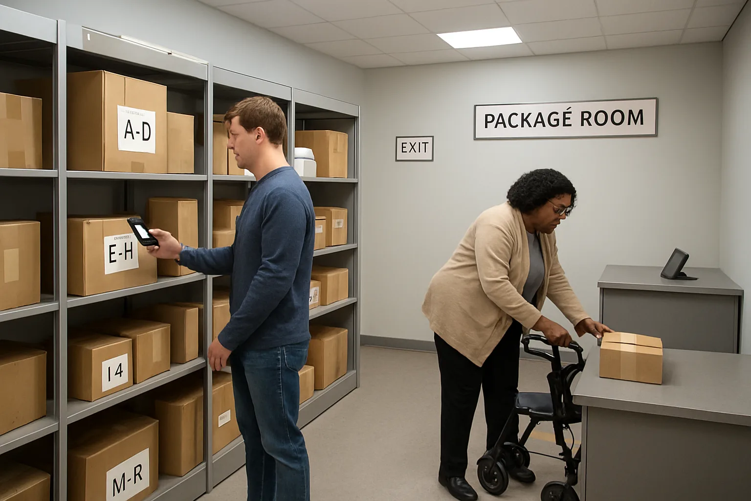
ADA package room best practices as measurable standards (not vague guidelines)
In a package room, accessibility is not a poster on the wall; it is whether a resident can independently find, reach, confirm, and carry a package from the correct location without extra help. ADA package room best practices become operational when they are expressed as measurable standards your team can train to and audit. The payoff is simple: fewer mis-shelves, faster pickups, fewer repeated questions at the front desk, and fewer staff interruptions to escort residents through a search.
The mindset shift is to treat accessibility like you treat carrier delivery windows or key control: define the standard, make it visible to staff, verify it routinely, and correct drift quickly. When you do that, inclusive resident experience stops being subjective and starts being repeatable across staff turnover, vendor changes, repainting, and seasonal volume spikes.
- Define accessibility in operational terms: can a resident with low vision, limited reach, or a mobility aid complete pickup without assistance and without touching multiple shelves or asking for directions?
- Convert guidelines into specs: measurable label sizes at viewing distance, minimum contrast targets, required clearances, and lighting/glare requirements.
- Audit what matters: check the room the same way residents use it—standing at the entry, at decision points, and at shelf edges during real peak clutter.
- Tie every standard to a failure mode (mis-shelf, wrong turn, blocked path, unreadable label, staff search time) so fixes stay prioritized.
Operational problems accessibility fixes (mis-shelves, slow pickups, repeated questions)
Most package-room friction looks like an operations issue, but it is often an accessibility issue in disguise. When labels are hard to read at the shelf edge, residents scan longer, touch more packages, and increase the chance of a wrong grab or a “this isn’t mine” re-shelf. When signage is inconsistent or relies on color alone, residents take wrong turns, backtrack, and create aisle congestion—especially during peak pickup windows. When high-volume shelves are out of reach or aisles pinch during deliveries, residents abandon the search and ask staff to intervene.
A useful way to prioritize improvements is to map each complaint or interruption to a specific breakdown point: entry orientation (Where do I start?), zone selection (Which aisle?), shelf identification (Which exact spot?), reach and handling (Can I access and carry it?), and confirmation (Did I pick the right one?). Each breakdown point can be addressed with a measurable standard rather than an ad hoc fix.
The ‘measure it’ framework: distance, size, contrast, reach, lighting, redundancy
A package room is a visual system, a physical system, and a process system. Measuring all three keeps “accessible signage” from turning into one-off label redesigns that fail the first time lighting changes or shelves get rearranged.
Use this six-part framework to define ADA package room best practices in concrete terms your team can inspect quickly:
1) Distance: Identify the real viewing distances in your room (entry-to-zone sign, across-aisle to aisle header, close-up at shelf edge). Design for those distances instead of assuming residents will walk up to every sign. This directly reduces wandering and repeated questions because residents can orient before they commit to an aisle.
2) Size: Set minimum type sizes for each distance band (far orientation signs vs shelf-edge labels). “Large-print shelf labels” should be specified for the actual scan behavior: quick glance, often while holding a phone, cane, walker, or another package. Size standards reduce mis-shelves because staff can read identifiers correctly during put-away, and residents can verify the right location without second-guessing.
3) Contrast: Choose a text/background combination and make a rule that it must meet your color-contrast standards before anything is printed. Contrast is what makes signs usable in mixed lighting, aging vision, and glare. It also reduces staff time spent “translating” or pointing because residents can see the same information staff sees.
4) Reach: Set reach-range rules for where high-frequency items go and where location identifiers must appear (for example: shelf-edge plus an eye-level duplicate). Mobility-friendly retrieval is not only about wheelchair access; it prevents drops, re-shelving, and blocked aisles when residents cannot comfortably access lower or upper shelves.
5) Lighting and glare: Measure and manage glare at the exact angles residents view labels (standing at shelf edge, looking down an aisle). Glossy laminates and bright downlights can erase contrast in practice. Glare control is an operational lever because illegible labels drive slower scanning and more “can you help me find…” interactions.
6) Redundancy: Build a two-channel identification rule so one failure (faded ink, torn label, low light) does not break retrieval. Redundancy can be print + tactile, print + QR, or shelf-edge + aisle header. This improves accountability and reduces mis-shelves because staff have more than one way to confirm the correct spot during put-away.
Minimum documentation to keep on file for consistency and turnover (label spec sheet, signage map, weekly audit checklist)
Accessibility standards only work if they survive turnover and room changes. Keep a small set of documents that make your system reproducible—so a new team member, a temp, or a vendor can restore it without guesswork.
Label spec sheet (one page): Document your label hierarchy (zone, bay, shelf), approved typeface(s), minimum font sizes by viewing distance, required contrast target, background color rules, material/finish (for glare control), and placement rules (where the duplicate identifier goes). Include a “do not” list (for example: no all-caps for long labels, no reflective laminates on shelf edges, no relying on color alone).
Signage map (one page + simple sketch): Mark the “decision points” where residents need information: entry, first junction, aisle starts, and any turns. Assign each sign a purpose (orient, confirm, warn, or direct) and a placement standard (height, side, line-of-sight). A signage map prevents well-meaning additions that clutter the room with conflicting directions—one of the biggest causes of slow pickups and repeated questions from residents who are trying to do the right thing but are getting mixed cues in the same visual field.
Weekly audit checklist (10 minutes): Make it a repeatable walk-through that a supervisor or lead can do during normal operations. Check for:
– Legibility: are shelf labels readable at the intended distance without leaning in?
– Contrast: have any replacements drifted to lower-contrast colors?
– Glare: do any labels “wash out” under current lighting?
– Obstructions: are aisles blocked by overflow, carts, or staging that reduces mobility-friendly retrieval?
– Reach: have high-volume locations migrated to hard-to-reach shelves?
– Redundancy: are duplicate identifiers present and intact?
– Exceptions: any damaged labels, full shelves, or ad hoc overflow areas that need a documented temporary system.
The key is consistency: a small documentation set keeps accessible signage and retrieval standards from decaying into a patchwork, which is when mis-shelves rise and staff escort time creeps back into daily work.
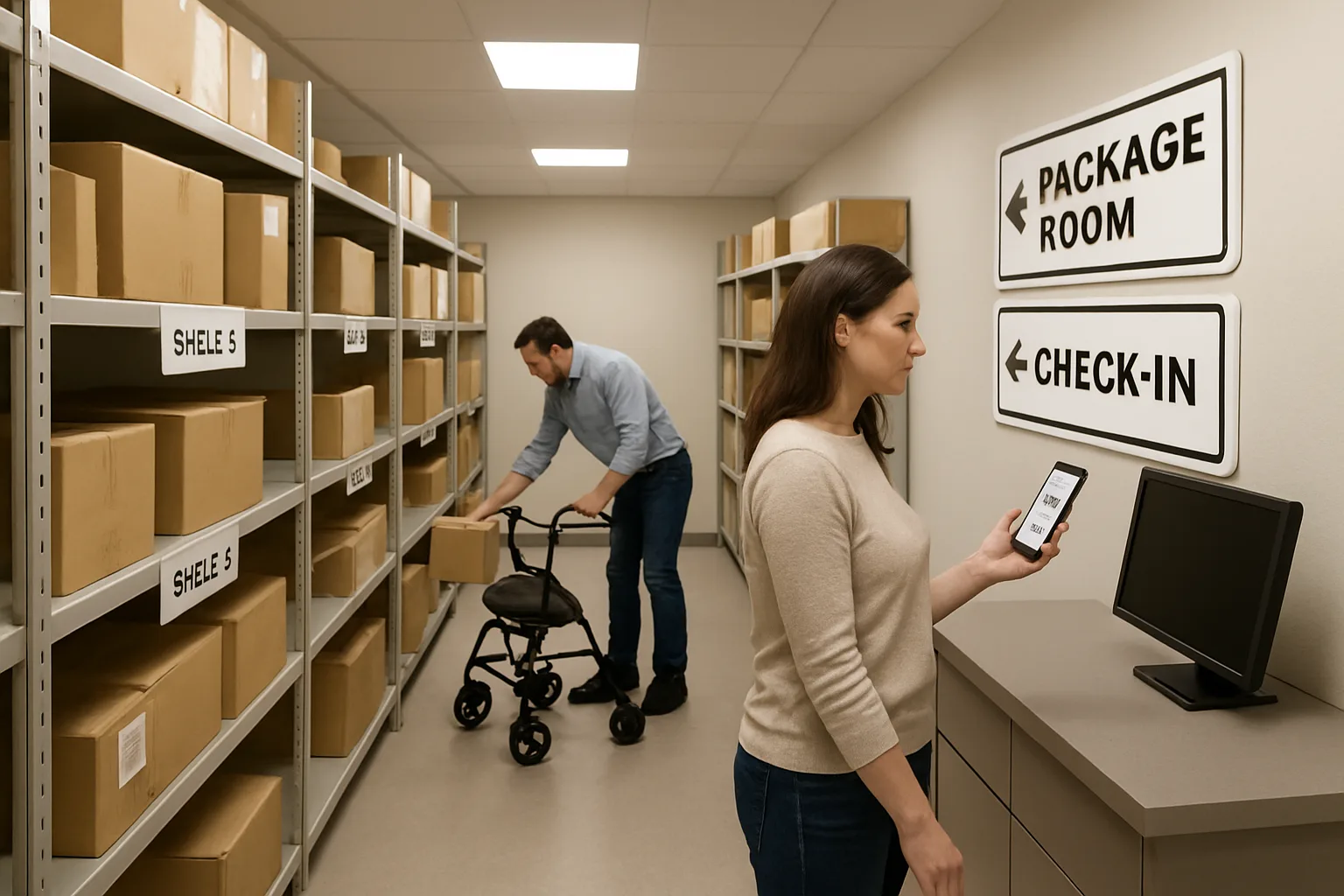
Designing large-print shelf labels residents can actually read (distance-based sizing + plain-language structure)
In a package room, labels are not decoration; they are the user interface. If residents cannot read a shelf identifier quickly and confidently, they will hesitate, walk the wrong aisle, re-check multiple shelves, or ask staff to help. The goal of ADA package room best practices here is simple and measurable: a resident with low vision should be able to locate the correct zone and shelf with minimal backtracking, and staff should be able to shelve correctly on the first try even during peak drop-offs.
Treat shelf labeling like an operational control: you define a standard (size, contrast, content, placement), train to it, and audit it. The payoff is fewer mis-shelves, faster pickups, and fewer front-desk interruptions that turn into “let me walk back there with you” escorts.
- Operational standard to adopt: every shelf location identifier must be readable at the distance it is meant to be used (close-up at the shelf edge, and across-aisle at the aisle header/zone marker). If it is not readable at that distance, it fails the standard and gets replaced.
- Operational standard to adopt: every location code must be unambiguous and speakable (a resident can read it out loud to staff, and staff can repeat it back without confusion).
- Operational standard to adopt: the same location identifier appears in two places: where the hand reaches (shelf edge) and where the eye looks first (at or near eye level).
Distance-to-font-size rules of thumb for large-print shelf labels (close-up vs across-aisle)
Most label failures happen because teams choose a single font size for everything. Instead, size text based on the viewing distance and the decision being made at that distance.
Use a two-layer approach: (1) close-up shelf-edge labels for confirming the exact spot, and (2) larger headers for orienting from several feet away (zone/aisle/bay). In practice, residents often stand 12–24 inches from a shelf edge when confirming a location, and 6–12 feet away when choosing an aisle or bay.
Practical sizing rules of thumb you can implement without specialized tools: start with the largest type that fits cleanly, then standardize it across the room so residents do not have to “re-learn” each aisle. If your room has longer sightlines, size for the worst case rather than the average.
Typeface, weight, and spacing choices that survive glare and aging vision
Legibility is not just “big text.” In mailrooms, glare from overhead lighting and reflective label materials can erase thin strokes and tighten letterforms into a blur. Aging vision also reduces contrast sensitivity, so small design choices compound quickly.
Choose a simple sans-serif typeface with clear character shapes (distinct 1, I, and l; distinct 0 and O). Use a heavier weight than you think you need; thin fonts disappear under glare. Keep text in mixed case or all caps only for short identifiers; long all-caps words are harder to parse quickly.
Spacing matters operationally because it affects scan speed. Add a little extra letter spacing for short codes, and ensure line spacing prevents lines from visually merging at a glance. Avoid compressed fonts and avoid placing text too close to label borders, where edge shadows and wear are common.
Label content hierarchy: zone, bay, shelf, and position—keep it unambiguous
Residents and staff succeed when the label tells them exactly where they are in the room, in the same order every time. A good hierarchy is: Zone (biggest), then Bay, then Shelf, then Position. Do not make residents decode your system on the fly.
Make the first line answer “Which area?” and the second line answer “Which exact shelf?” Keep wording plain-language and consistent across all signs and labels. If you use codes, define them once on a prominent legend at the entry and repeat the pattern everywhere.
Avoid overloaded meaning. If “A” is a zone, do not also use “A” to mean “top shelf” or “Apartment.” Reserve letters for one purpose, numbers for another, and use separators consistently so people do not misread a string of characters.
Error-proofing: duplicate identifiers on the shelf edge and at eye level
A common failure mode is forcing residents to crouch, lean, or scan along shelf edges to locate a code. That increases retrieval time and increases the odds of someone placing a package back on the wrong shelf because they never confirmed the identifier.
Duplicate the identifier in two locations: (1) the shelf edge, at the point where the package is placed or retrieved, and (2) an eye-level marker that helps people navigate without bending or stepping into the aisle. Eye-level duplication can be a small placard on the bay upright, an endcap marker, or a header strip aligned to the bay.
This redundancy is also a staff-control feature. When shelving quickly, staff can glance at the eye-level marker to confirm the bay, then use the shelf-edge label to confirm the exact shelf. That two-step confirmation reduces mis-shelves during peak delivery windows and reduces resident complaints later.
Examples: ‘A-3-2’ vs ‘Aisle A / Bay 3 / Shelf 2’ and when each works
Both formats can work if they are implemented consistently and matched to how residents actually search.
Use short codes like A-3-2 when: the room has clear, large aisle headers; the code is repeated at eye level and on the shelf edge; staff use the same code in any logging or handoff process; and residents can ask for help by reading the code out loud without ambiguity.
Use plain-language like “Aisle A / Bay 3 / Shelf 2” when: the room serves a high proportion of seniors or first-time users; cognitive load is a known issue (residents frequently ask “what does this mean?”); or you want to reduce training needed for temporary staff and reduce the risk of confusing similar codes (for example, A-3-2 vs A-8-2). A strong compromise is a hybrid label: the plain-language line first, with the short code as a secondary line for staff speed and logging consistency.
Accessible signage and color-contrast standards that improve wayfinding (and reduce wrong turns)
In a busy package room, wayfinding fails in predictable ways: residents enter, hesitate, take the first aisle, then double back, or they follow color cues that are meaningless in low light or for color-vision deficiencies. Every wrong turn adds time, increases crowding at peak pickup hours, and drives staff interruptions ("Can you help me find Shelf B?"). ADA package room best practices treat signage as an operational control: consistent contrast, placement, and redundancy that reduces cognitive load and keeps traffic flowing.
paragraphs are not just about compliance. In practice, a legible, consistent sign system reduces mis-shelves (staff can quickly verify they are in the right zone) and speeds pickups (residents self-navigate without asking). The key is to define measurable sign specs you can audit the same way you audit package accuracy: contrast, size, placement, and glare resistance.
- Operational goal to design for: a first-time visitor can reach the right zone without asking for help, and a low-vision resident can confirm they are in the correct aisle from the entry door.
- Standardize a sign kit: one style for room entry, one for zone markers, one for aisle headers, and one for shelf-range pointers. Consistency is more helpful than fancy graphics.
- Treat every turn or choice as a decision point: if someone can go left or right, add a sign before the decision, not after it.
Contrast ratios: what to target for text-on-background in real rooms
Color contrast is the simplest, most measurable upgrade you can make. It is also one of the most commonly undermined by real-world conditions: dim corners, mixed lighting temperatures, glossy laminates, and signs mounted behind scuffed plastic sleeves. Set a contrast target you can check during procurement and re-check after installation.
For ADA package room best practices, aim for high contrast between text and background. As a practical standard that works across most rooms: use very dark text on a very light background (or the reverse) and avoid mid-tone combinations (gray on gray, blue on black) that collapse under glare. If your team has the tools, verify contrast using a contrast checker during design review, then spot-check printed signs in the actual room lighting.
Operational tie-in: better contrast reduces "near-miss" navigation where residents walk down the wrong aisle and only realize it when they are close to the shelves. Those near-misses create backtracking and crowding, which increases the chance of mis-shelving during busy periods.
Color use: never rely on color alone; pair with shapes, letters, and patterns
Color can help speed recognition, but it should never be the only carrier of meaning. Many residents have reduced color discrimination, and low light can erase color differences. Build redundancy into the wayfinding system so a resident can navigate using shape and text even if color is not perceived.
A simple, resilient approach is to assign each zone a letter plus a distinctive shape icon, then optionally add color as a tertiary cue. Example: Zone A is a triangle icon with the letter A; Zone B is a square icon with the letter B. If you later repaint walls or replace decals, the system still works because the letter and shape remain constant.
Operational tie-in: redundancy reduces repeated questions at the front desk ("Is green shelves aisle 3?") and reduces training overhead for new staff. Staff can use the same language residents see on signs: "Go to Zone B (square), Aisle 2."
Placement rules: consistent height, line-of-sight, and decision point signs
Placement is where good signs fail. A perfectly designed sign does nothing if it is mounted behind an open door, above eye line, or only visible once a resident has already committed to the wrong aisle. Establish placement rules your team can apply consistently, even as the room changes.
Use a line-of-sight approach: from the entry, residents should be able to see a primary orientation sign and at least the zone markers they need to head toward. Then, at each decision point (where aisles branch, where the room opens into multiple rows, or where identical shelf banks begin), place a sign before the choice so residents can select the correct path early.
Keep mounting heights consistent across the room so residents are not forced to scan up and down. If you must post temporary notices (overflow instructions, carrier notes), place them in a dedicated area separate from navigation signage so critical wayfinding is not buried in clutter. This also improves the inclusive resident experience by reducing visual noise for people with cognitive load or low vision tendencies toward overwhelm.
Glare control: matte materials, lighting angles, and avoiding reflective laminates
Glare is a silent wayfinding killer. A sign that looks readable at noon can become unreadable at night under LED fixtures or when viewed at an angle by someone in a wheelchair. Treat glare control as part of the sign specification, not a finishing detail.
Prefer matte sign surfaces and non-gloss inks. Avoid glossy laminates and clear acrylic covers on critical wayfinding signs; if protection is required, use matte anti-glare covers and test them under the actual lighting. Place signs so overhead fixtures do not reflect directly into the viewing angle. If you have to mount near lights, angle the sign slightly or relocate it to reduce specular reflection.
Operational tie-in: glare-resistant signage reduces the "stand in the aisle and tilt your head" behavior that blocks traffic during peak pickup windows. Less stopping and crowding means fewer rushed shelving decisions, which in turn means fewer mis-shelves.
Wayfinding map example: entry sign, zone markers, aisle headers, and ‘You are here’ reference
A package room does not need a complex map, but it does need a consistent hierarchy. Below is a practical layout you can adopt and then audit. The goal is to let residents confirm location in layers: room level, zone level, aisle level, then shelf range.
Example wayfinding system (adapt to your footprint):
1) Entry orientation sign (at the door, readable immediately upon entry). Content: "Package Room" plus a simple overview: Zones A–D, with each zone’s letter and shape icon, and a short note like "Oversize items: Zone D." Include a small "You are here" marker if there are multiple entrances or an L-shaped room. If there is only one entrance and the room is simple, the "You are here" can be a directional arrow ("Zones A–B left, Zones C–D right").
2) Zone markers (mounted at the start of each zone, visible from the entry where possible). Content: big letter (A, B, C) + shape icon + optional color stripe. Keep the design identical across zones.
3) Aisle headers (mounted at each aisle entrance). Content: "Aisle 1" plus which zones are contained ("Zone B") if an aisle is zone-specific, or the range of shelf identifiers if you use them ("B1–B4").
4) Shelf-range pointers (mid-aisle, at eye level). Content: directional range indicators like "B1–B2 this side" and "B3–B4 next bay." This prevents residents from walking all the way down an aisle just to discover they are in the wrong half.
5) Exception signage (separate from navigation). Create one consistent location for temporary instructions (overflow shelf, carrier notes, holiday volume changes). Label it clearly as "Notices" so it does not compete with wayfinding.
Operational tie-in: this hierarchy reduces wrong turns because residents can confirm they are on track at multiple points without having to read tiny shelf labels from far away. It also improves staff speed during restocking because "zone then aisle" becomes the default mental model, reducing cross-zone mis-shelves when volume is high.
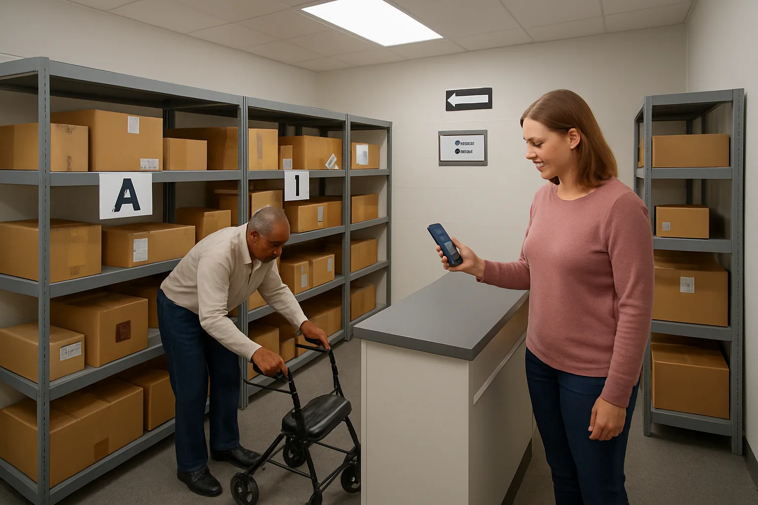
Mobility-friendly retrieval: reach ranges, clearances, and ‘one-hand’ interactions
Mobility-friendly retrieval is where ADA package room best practices turn into real time savings. When shelves are within comfortable reach, aisles stay passable, and doors work with a single hand, residents can complete pickups without asking for help, and staff spend less time escorting searches or re-shelving dropped items. The goal is not perfection on paper; it is a repeatable setup that works during peak delivery volume, with walkers, wheelchairs, canes, and one-handed carrying.
Think in two layers: the physical environment (reach ranges, clearances, hardware) and the operating flow (where carriers stage, where residents queue, and how staff respond when the room gets congested). If either layer fails, you will see the same operational symptoms: blocked access, slower pickups, packages set down in the wrong place, and more staff interruptions.
- Operational outcomes to track as you improve mobility-friendly retrieval: fewer ‘can you grab this for me’ requests, fewer dropped/damaged packages, fewer mis-shelves caused by residents abandoning searches, shorter average time-in-room during pickup windows, and fewer safety complaints about tight aisles or heavy doors.
Reach-range planning: where to place high-volume shelves and oversize items
A reach-range plan prevents the most common mobility failure: making the most frequently used shelves the hardest to access. In many rooms, the most convenient locations are accidentally reserved for overflow, while daily pickups are forced to upper shelves, deep bending, or awkward side reaches.
Set a clear rule for where high-volume parcels live. Use the most accessible vertical band for the fastest-moving inventory (small and medium packages), and reserve the extremes (very high, very low, or deep shelves) for low-frequency storage or staff-only staging. For residents using mobility aids, the difference between a comfortable reach and a stretch can be the difference between independent pickup and a staff escort.
Aisles and turning zones: keeping routes passable even during delivery peaks
Aisle width that feels fine at 10 a.m. can fail at 4 p.m. when a carrier drop blocks half the route. Mobility-friendly retrieval means planning for the room at its busiest, not at its emptiest.
Treat passable routes as non-negotiable. Define a primary circulation path from the door to the main shelving zones that should never be used for staging. Then create a separate, intentional staging zone for carriers and staff. If staging is not explicitly designed, it will happen wherever there is empty floor, and that is usually the exact place a wheelchair or walker needs to pass.
Turning space is part of throughput. If a resident must do a multi-point turn to exit an aisle, you will get bottlenecks, frustrated line formation, and packages placed temporarily on random shelves. Mark turning areas (even with simple floor tape) and keep them clear in daily checks, especially near the entrance, corners, and any authentication station (logbook, scanner, or pickup counter).
Door and latch choices that reduce assistance needs (lever handles, hold-opens)
Doors are a hidden source of friction. A heavy closer, a round knob, or a latch that requires tight grasping turns every pickup into a two-handed task. That is a problem when someone is carrying a box, using a cane, or pushing a walker.
Standardize on ‘one-hand’ access: lever handles instead of knobs, hardware that does not require pinch grip, and a setup that allows the door to be opened and passed through without wrestling it shut behind you. If security requires controlled access, consider solutions that still minimize force and fumbling (for example, a controlled entry with a door that can be held open during staffed peak windows).
Operational link: when doors are easy to use, residents are less likely to prop them open unsafely, less likely to abandon packages in the doorway, and less likely to request staff assistance just to get in or out. That reduces safety risk and keeps the entry clear for the next person.
Counter/bench staging: a simple addition that reduces drops and re-shelving
A small staging surface can be the highest-leverage accessibility upgrade in the room. Residents often need a place to set down a bag, steady a cane, check a shelf label, or reorganize items before leaving. Without a surface, they use the floor, a random shelf, or the nearest stack of packages—which creates mis-shelves and damage risk.
Add a stable bench or counter in a predictable location near the exit path, not in the main circulation lane. The surface should be easy to see, kept clear by policy, and treated as part of the retrieval flow: pick up, verify, stage briefly if needed, then exit.
Make it operationally real: include ‘staging surface clear’ in the opening/closing checklist, and give staff a simple script when they see items accumulating there (for example, redirect residents to complete pickup and clear the surface, or move unclaimed items to a designated exception bin rather than re-shelving at random).
Peak-time flow: how to avoid cross-traffic and blocked paths during carrier drops
Most accessibility failures happen during peaks: carriers arriving, residents lining up, and staff trying to log items while answering questions. The fix is a flow design that separates these movements so people are not passing each other in tight corridors.
Define a carrier drop path and a resident pickup path. Even in a small room, you can reduce cross-traffic by setting a single-direction pattern: enter, move to zone, retrieve, stage/verify, exit. Post a simple instruction sign at the entry and reinforce it in staff guidance during the busiest hours.
Create a ‘no-staging’ boundary for the main route and enforce it. If you allow carriers to stack parcels in the aisle ‘just for a minute,’ that minute turns into a backlog, and residents with mobility aids are the first to get blocked out. Provide a marked staging footprint (floor tape or a labeled rack) so the default behavior supports access rather than undermining it.
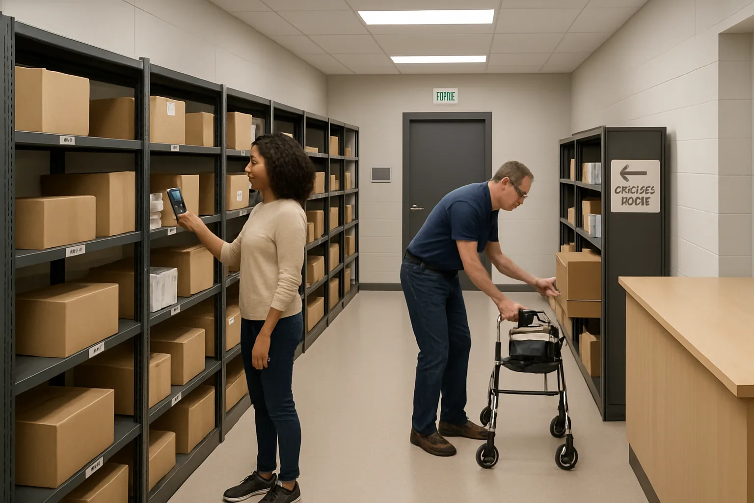
Make Your Package Room Easier to Use and Easier to Run
If your team is spending time on “help me find it” escorts, repeat questions, or mis-shelf rework, start by turning accessibility into a written standard: label specs, signage placement, reach/clearance rules, and a weekly audit checklist. TrackNest can support that operational discipline with clearer handoffs and location accountability so packages get shelved consistently and residents can retrieve with confidence.
See how TrackNest supports accountable package-room workflows
Accessible Package Rooms Stay Accessible Because They Are Operated That Way
Accessibility improvements only pay off when they are treated like any other operating standard: specified, trained, checked, and maintained. Large-print shelf labels that match viewing distance, accessible signage that is placed at decision points, color-contrast standards that survive lighting changes, and mobility-friendly retrieval routes do not just support ADA-aligned access—they directly reduce mis-shelves, shorten pickup time, and cut the steady drain of staff escorts and rework.
The most effective teams keep it simple and measurable. Pick one labeling standard your staff can repeat perfectly, one wayfinding improvement that reduces the first “wrong turn,” and one reach/flow fix that prevents blocked paths during peak drops. Then audit weekly: is it legible, is it visible without glare, is it reachable, is the path clear, and is the identification redundant enough to prevent a single point of failure (like a torn label).
Adopt-this-week starting point: standardize one zone with distance-based large-print shelf labels, add a single high-contrast entry sign plus aisle headers, and relocate the highest-volume pickup shelves into the most reachable band. Run that as a pilot for a week, capture where residents still hesitate, and adjust before rolling the same standard across the entire room. The result is not just compliance-minded design—it is a package room that runs with less confusion, fewer complaints, and less staff time spent searching.